Skip to content


With the new year well under way now, we decided to ask some industry experts their opinion and to let us in on their trend forecasts for the coming year. It’s been an interesting time so far in the interiors world with Pantone choosing two colours (for the first time ever!) for the Colour of the Year 2016. So, we scouted around a bit and looked into some different areas of interior design and found inspiring predictions from four very different style gurus. If you are about to re-decorate and want to know what’s hot for the coming year – then read on!
Rob Whitaker, Creative Director, Fired Earth
“Concrete and stone-effect tiles in palettes of warm greys and honey browns are a key trend for 2016. Tiles are becoming increasingly popular throughout the home – they’re no longer confined to kitchens, bathrooms and hallways – and the latest ranges would be a stylish addition to any room.
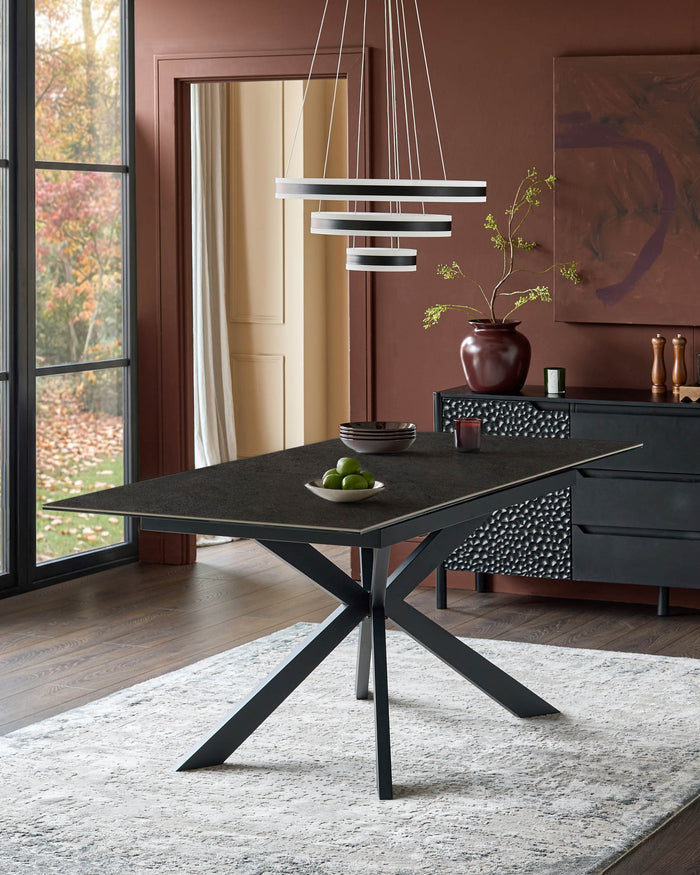
Products such as Danetti's ceramic dining tables are perfectly in keeping with the trend and they’re incredibly versatile. Use them in dining rooms for a crisp, contemporary look or in kitchens/breakfast rooms for an urban, industrial edge. Vinyl is something else to look out for in 2016 and we’re really excited about Fired Earth’s new luxury vinyl range, a sophisticated yet low-maintenance collection of stone and wood-effect flooring that pairs perfectly with ceramic finishes.
Customers are always on the look out for products that combine style and performance, and the latest ranges have very much been designed with this in mind. There’s also an on-going trend for using bold geometric pattern throughout the home. Fired Earth’s new Futurism wall tiles – which come in left and right hand formats – can be configured to create countless designs, and this summer will see the launch of some stunning Moroccan tiles in eye-catching Moorish motifs so there’s lots to look out for.”
Laura Higgins, Lifestyle Editor, Your Home
‘Ice cream shades are set to become even more popular this spring/summer. Pantone announced candy shades of blue and pink as their colours of the year, which can be used alone, or combined.
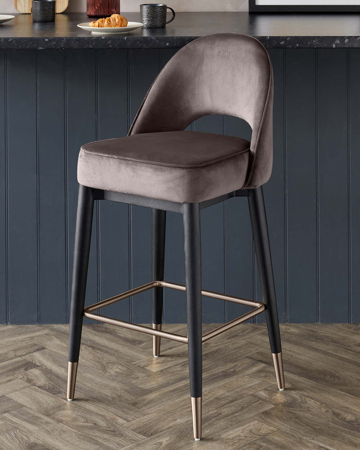
These pastels, along with soft lilac, minty green, and creamy yellow, create a pretty, feminine scheme but are muted and chalky, rather than sickly shades, and should be teamed with warm neutrals and a few shots of deeper tones to add depth. The trend for metallics is also continuing into this year, with shimmering gold and bronze bringing many trends up-to-date. Introduce bronze into your home in a subtle way with bronze finished furniture like Danetti's clover bar stool.
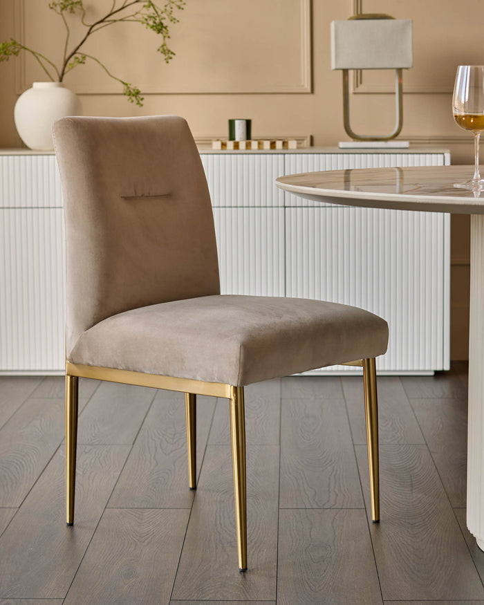
The metal taking centre stage this spring summer though is brass, looking to compete with copper which was huge in 2015. You can also subtly bring brass into your home with the likes of brass finished dining chairs. My predictions are that hints of metallics will keep a trend, such as pastels, fresh and modern. Or will come into their own when teamed with deep, dark colours, such as indigo, which is also set to be a strong colour this year.'
Martin Aveyard, Design Director, Moon
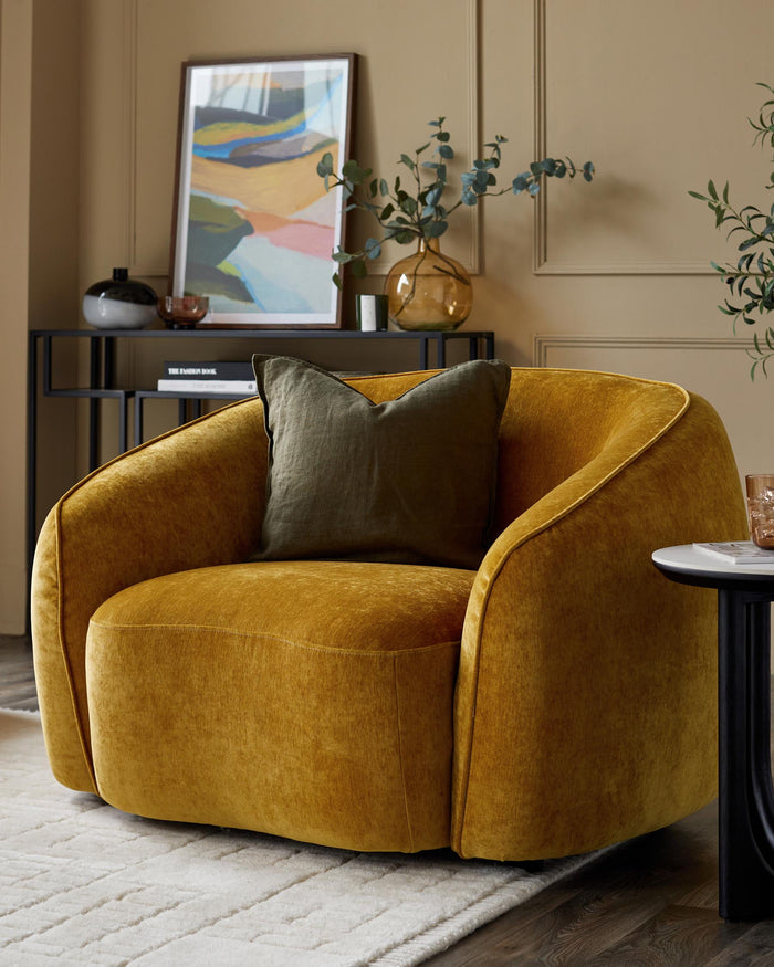
‘Grey continues to be a popular shade for 2016 and is the neutral of choice within the home, from slate greys to deep charcoals, it’s a perfect base hue when decorating. With the announcement of Dulux’s 2016 colour of the year, Cherished Gold, ochre shades and mustard yellows have seen a new emergence – this palette paired against greys creates an exciting combination and with the modern revival of the 70s, yellow has been reinvented to work with in both contemporary schemes as well as sophisticated country homes.
Introduce the yellow tones gradually through the use of soft furnishings such as throws and rugs or for those who are brave enough, a bold and bright golden coloured wall will be the perfect design statement for 2016’.
Ali Miller, Designer/Artist, Ali Miller
‘For 2016 my predictions are there will be a large focus on contrasting textile fabrics, materials and colours. We started our interpretation of this last year with our HomeSweet Home cushion and the combination of the linen and the felt to create texture and depth.
This year we will continue to develop this further by looking at the contrast of printed upholstery against the dark wood of an armchair, looking at reintroducing neon flashes in an all over print. This was previously seen a few years ago but i think a lot of designers will be revisiting it this year. Continuing the contrasting theme all over prints on a stark white background and the introduction of bold metallics is also a trend that will be seen emerging from various designers including myself this year.’