 Skip to content


Danetti Blog
Quick reads to help and inspire.
Danetti Blog
Browse all of our blogs to make your house feel like home
Articles by Room
Don't miss a thing
 Styling Tips Georga West
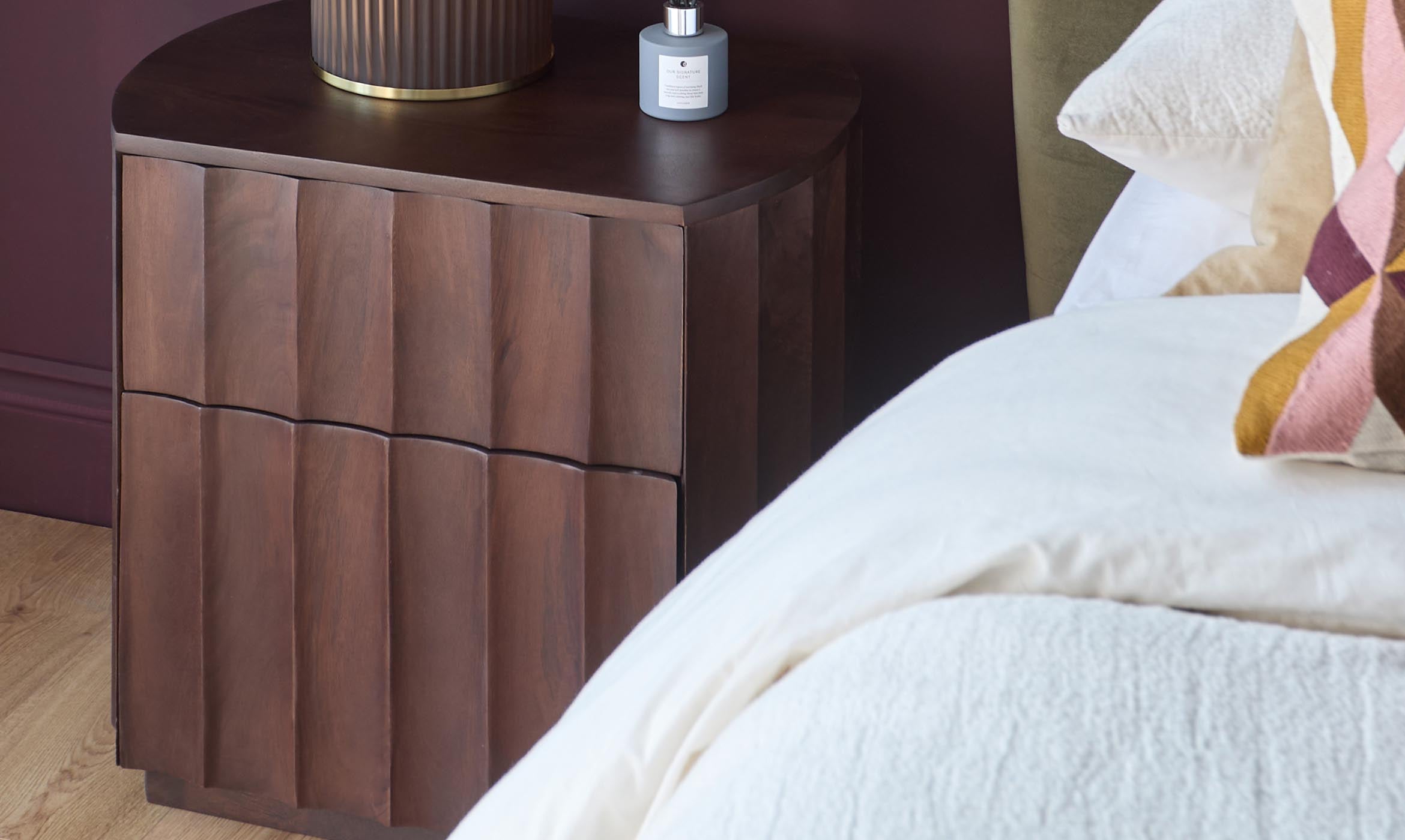
Ideas for Styling your Bedside Table
A well-styled bedside table does more than hold your book and lamp. It brings harmony to your bedroom, balancing function with a sense of calm, personal charm, and design flair.In this guide, we’ll share curated styling ideas - from timeless pairings to clever storage solutions - that make your bedside table a true reflection of your space.Read More Styling Tips Georga West
7 Small Dining Room Design Tips: Stylish Ideas for Compact Spaces
Create a stylish small dining room with our 7 expert design tips. Discover space-saving furniture, lighting ideas and décor tricks to maximise compact spaces.Read More
 Buying Guides Ciara Dickson
Buyers Guide for Different Armchair Styles and Types
An armchair is more than just an extra seat in the house; it is a perfect opportunity to either complement or complete your current sofa set-up. Armchairs come in a range of different shapes and sizes, and in this article we will cover different armchair styles, tips on where it’s best to place your armchair and other factors to consider within the design, support and sizing.Read More Buying Guides Georga West
A new Era of beige with Mocha Mousse: Pantone’s Colour of the Year 2025
The year of 2025 has been dedicated to the colour ‘Mocha mousse’ and we’re here for it. At Danetti, we research and forecast trends in both colours and interiors, and we have long been talking about new neutrals taking over we think it has come at the perfect time.Read More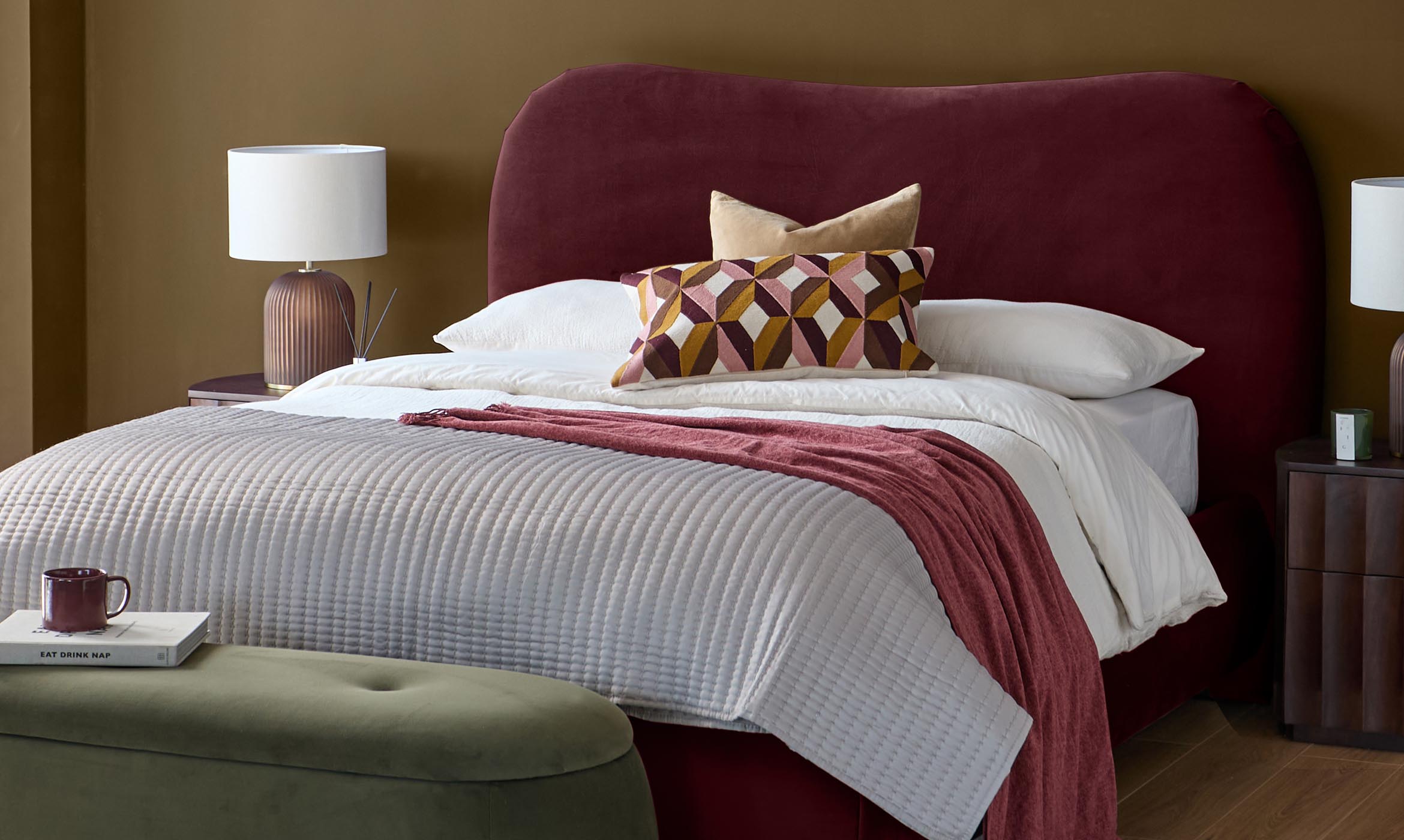
 Interior Focus Amanda Hollwey
The Colour of the Moment: Plum – A Velvet Colour Masterclass
When choosing a sofa colour is one of the most important factors. Buy for style that will last, not a trend that may fade. We tell you how to use Grape, and create a cosy living room that you'll love.Read More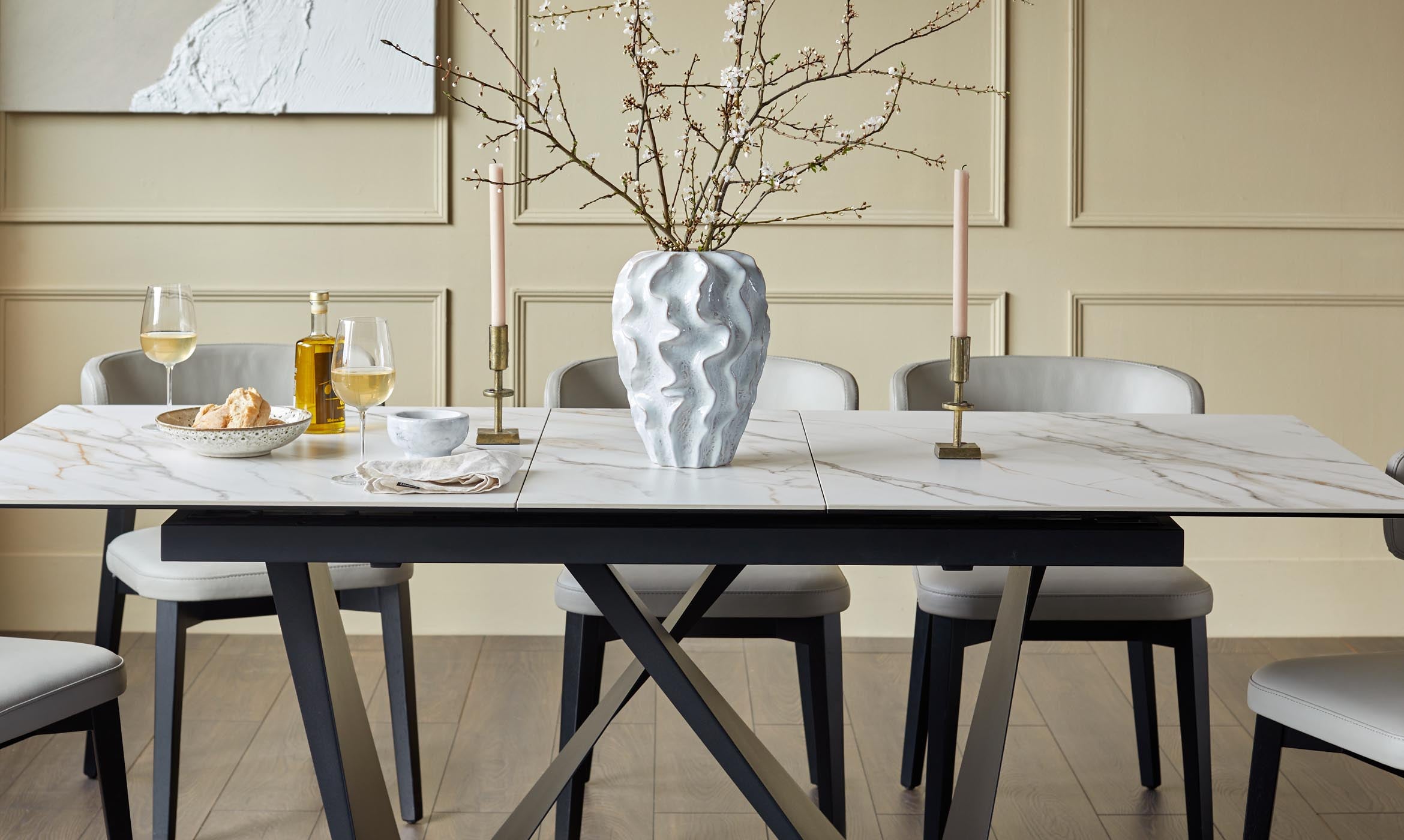 Interior Focus Georga West
Space-Saving Dining Solutions: Our Guide to Choosing the Perfect Dining Table
Makes yours the table everyone wants to gather around this festive season.Read More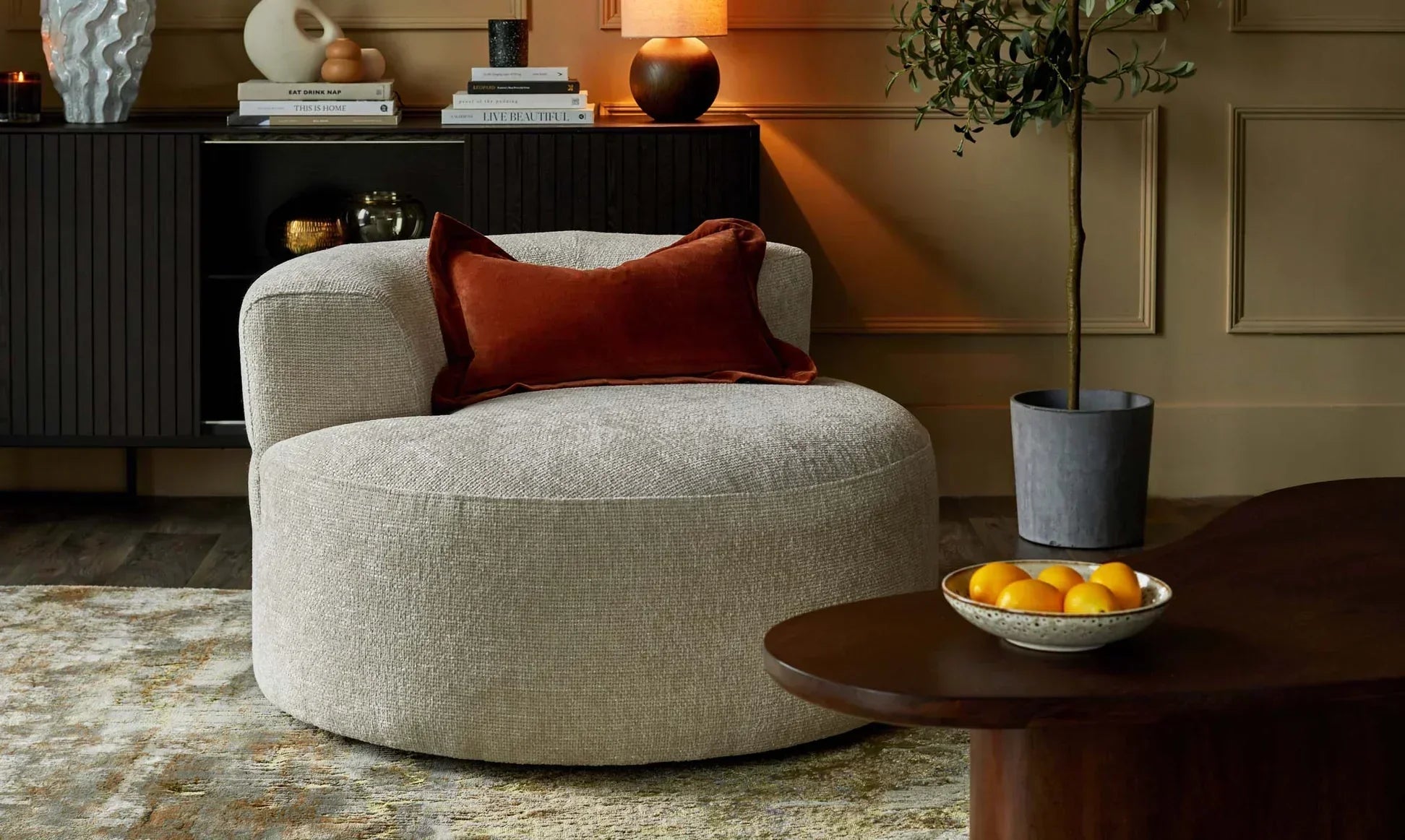
 Trending Georga West
Natural Materials in Interiors: How to Apply Biophilia in Your Home
Over recent years there has been a significant shift in design trends as people seek to reconnect with nature and create a more restful sanctuary of their homes to provide respite from an ever-developing world.Read More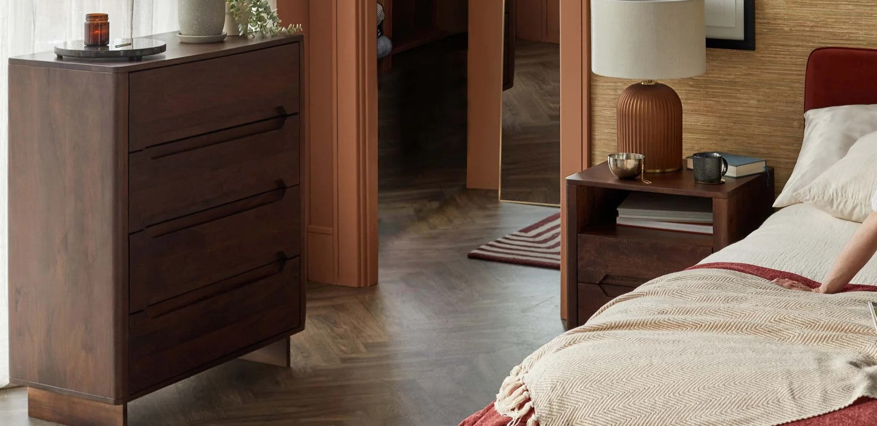 Trending Georga West
Dark Wood Furniture in Interiors: The Timeless Trend Making a Comeback
Dark wood furniture in interiors have been used for centuries to add an element of opulence and luxury to a space, and recently we have seen a resurgence in dark wood making a comeback to our homes, but why now? And what has changed?Read More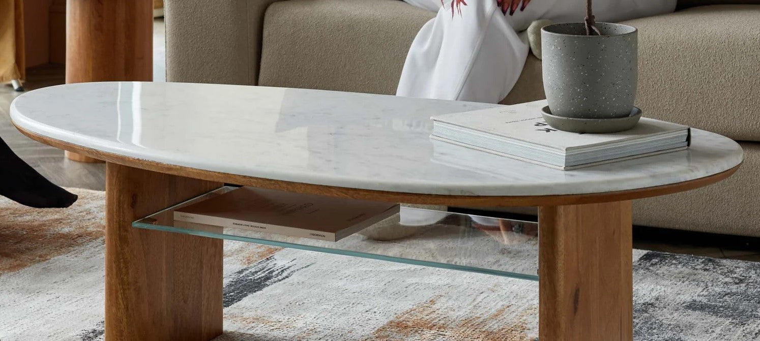 Trending Georga West
Marble Marvels: Transform Your Home With Timeless Marble Effect Furniture
Marble style furniture has long been associated with luxury and timeless elegance. Today, it is enjoying a resurgence in popularity as a design trend. A beautiful and luxurious material, marble has an inherent durability and timeless aesthetic appeal and comes with a more premium cost.Read More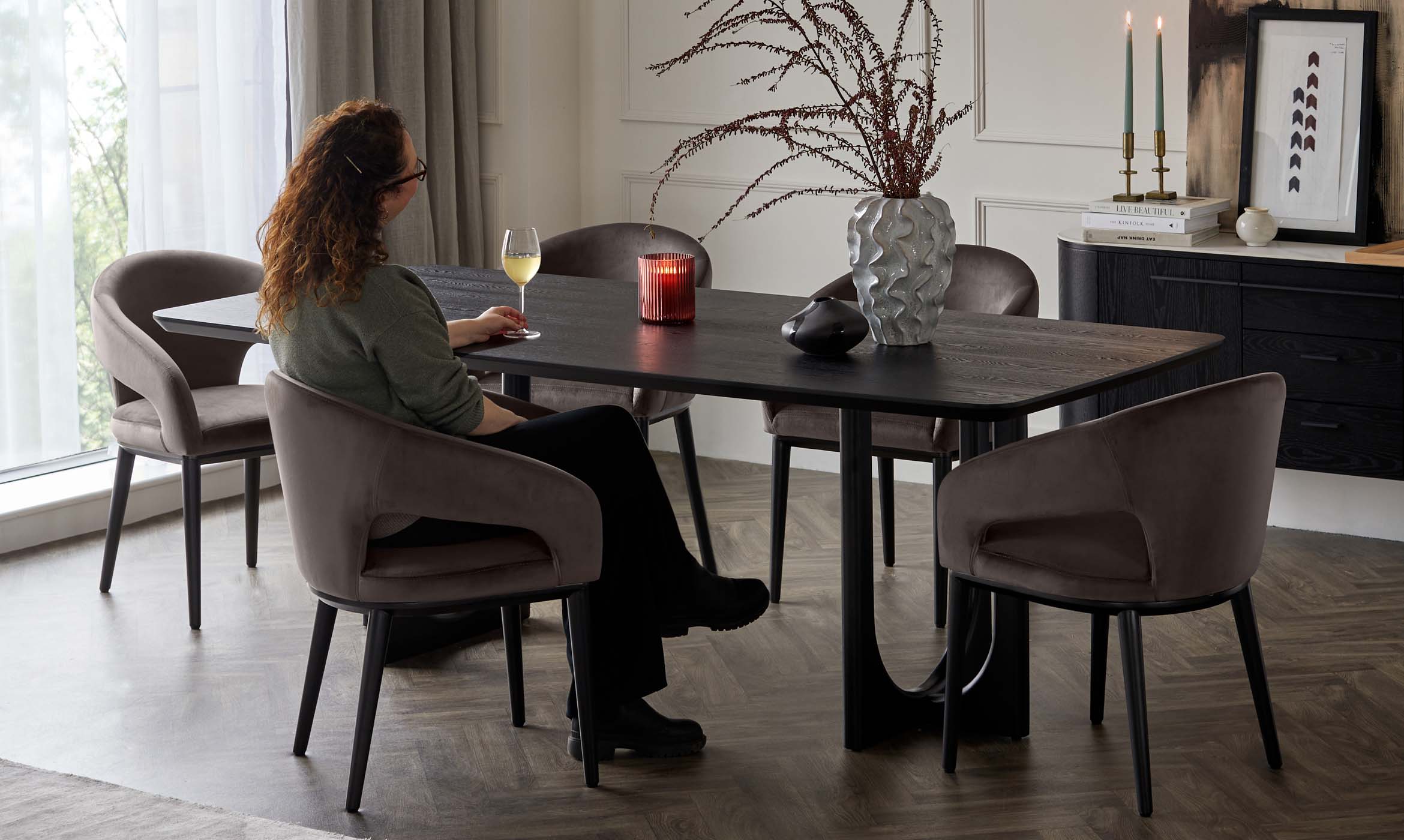 Trending Georga West
Curved Comfort: Transform Your Living Space with Rounded Furniture
Rounded furniture has been on the rise since 2021 when ‘crescent sofas’ first made their return, and there’s a significant reason for this. Post-pandemic trends saw a massive shift toward creating ‘calming sanctuaries’ of our homes and seeking comfortable spaces where we could feel relaxed and truly unwind.Read More Styling Tips Georga West
Mastering the Art of Living Room Styling: A Comprehensive Guide
When it comes to styling a home, everyone has their own specific taste, but when it comes to styling a living room, there are some helpful guidelines which we have shared which can make the process a whole lot easier.Read More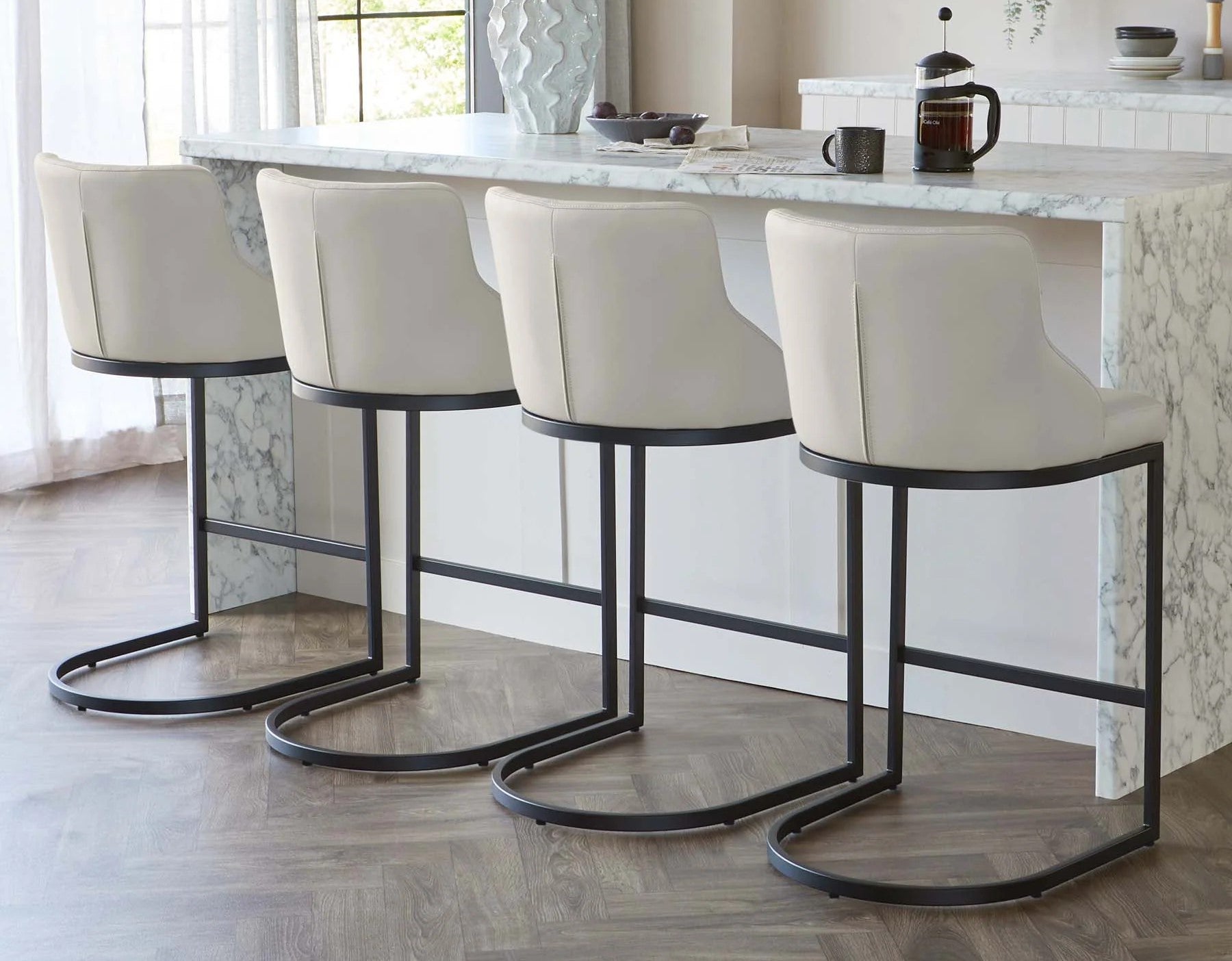 Buying Guides Georga West
Choosing the Perfect Leather Bar Stool for your home
Follow our guide to help you buy the right bar stools. We'll take you through material and colour options, what material is easiest to clean, why our designs are durable and which style works best for you.Read More
 'How to' hub Georga West
A Guide to Cleaning Your Danetti Mirror
Cleaning a mirror can require a certain element of skill, but with our handy guide, we will take you through the steps to look after your Danetti mirror and to keep it look good for longer.Read More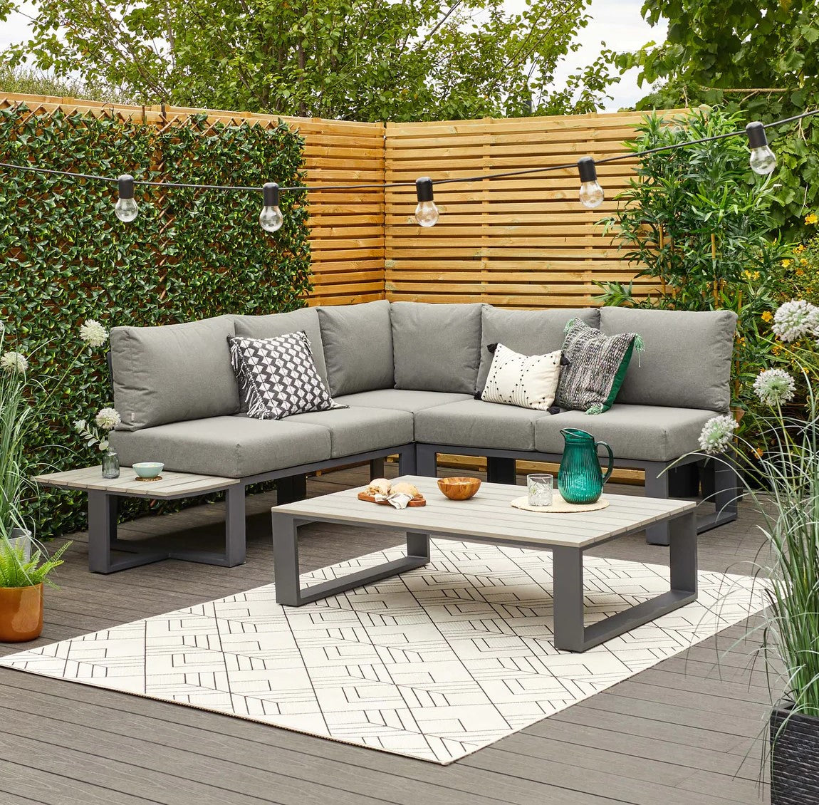 Buying Guides Georga West
The savannah modular garden range, the garden furniture you didn’t know you needed till now
Learn about our Savannah garden set and why it's comfort, modular fittings and lightweight, waterproof fabric make it a perfect choice for your garden.Read More Trending Georga West
Bronze Brilliance: Embracing the Warmth of Bronze in Contemporary Décor
Bringing a new metal into your home can seem like a scary prospect and can often be met with thoughts of having to swap out all your old furniture. Rest assured though, with this guide we can take you through how to incorporate bronze into your home, without the need to completely redesign your home.Read More Buying Guides Georga West
How to Choose the Right Sofa for Your Living Room
Choosing the right sofa for your living room is a challenging and important decision. We'll take you through the key considerations you'll need to make before committing to purchase so that when you're ready to buy, you can know you will be buying the right sofa for you and your family.Read More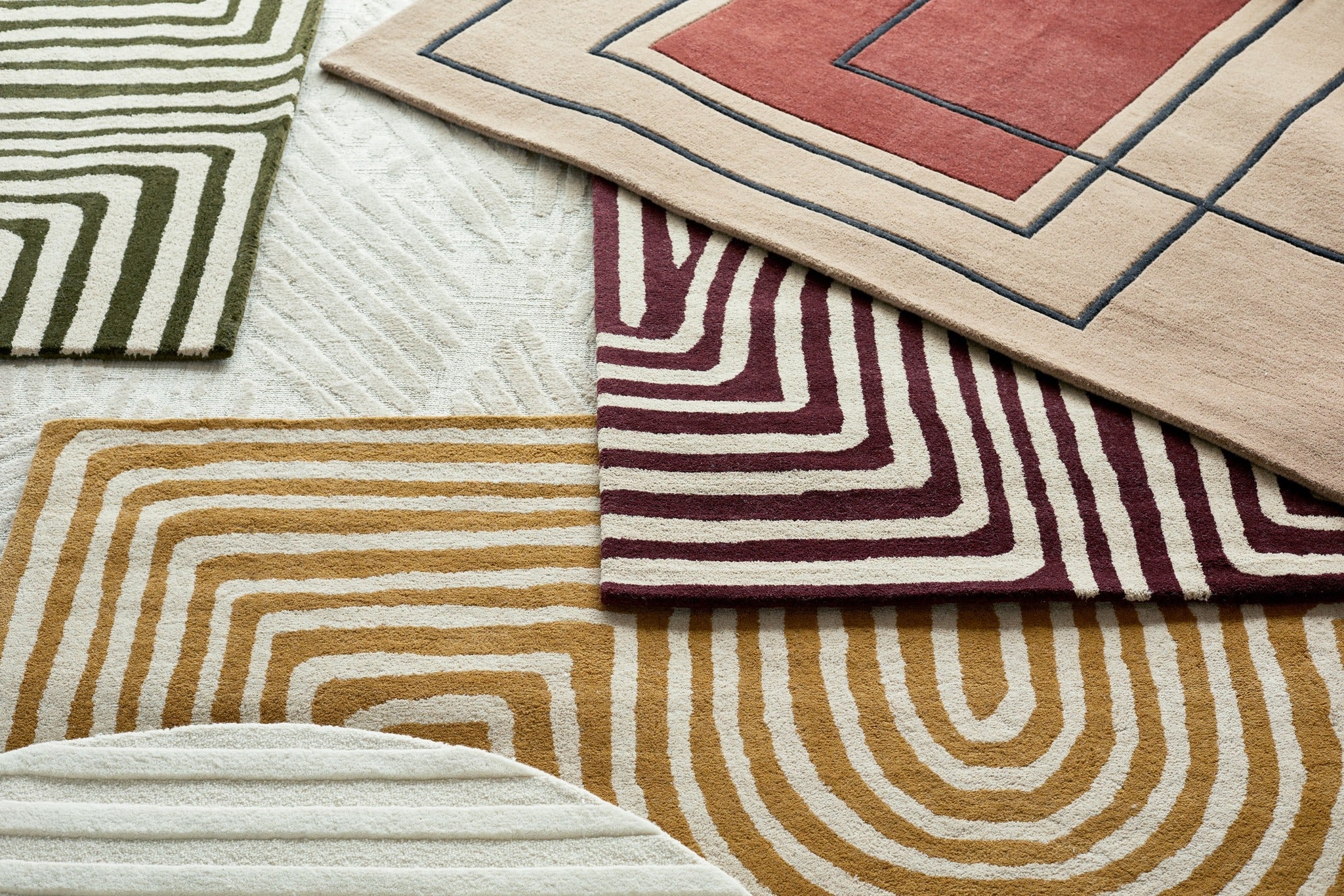 Styling Tips Georga West
The Ultimate Guide to Buying Rugs: Choosing the Perfect Size, Shape, and Style
Rugs can add warmth and texture to a room, but how to style a rug and the placement can sometimes be challenging. Read our guide for our stylists tips on how best to style a rug.Read More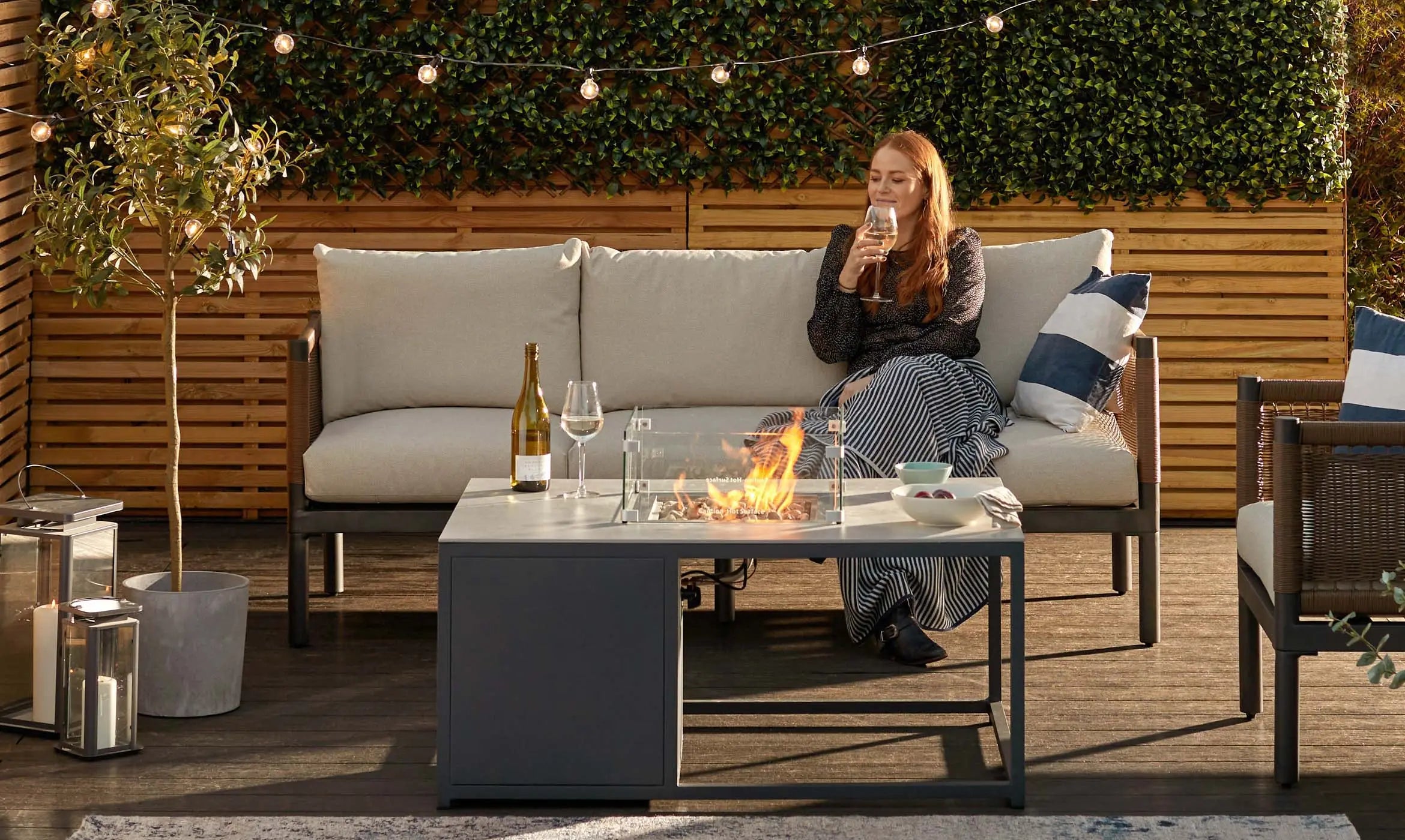 Buying Guides Georga West
Danetti's 2024 Garden Furniture Collection: Modern Elegance for Outdoor Living
Take a look at our 2024 garden collection and the styles within it.Read More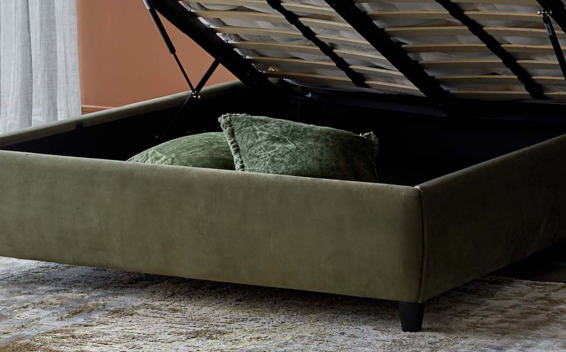 'How to' hub Georga West
Making the Most of Smaller Spaces: Furniture Trends
In todays modern world, many of us are finding ourselves in smaller living spaces giving many people the challenge of styling vs practicality when it comes to their homes. In this blog we have tips and multipurpose furniture recommendations so you can make the most of your space as well as having it look good too.Read More Buying Guides Georga West
Embrace Outdoor Living with the Tuscany Range
Uncover our Tuscany range and the design elements behind it, making it unique to Danetti, with its quality craftmanship, versatility and stylish design.Read More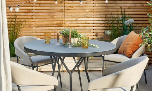 Buying Guides Georga West
5 Reasons Why You Should Choose Danetti Furniture for Your Garden
When it comes to garden furniture, it’s the little things that make a big difference and with all our products at Danetti we have really thought about how we can elevate each piece to make it practical for you. From waterproof materials to considerate storage designs, find out why you should chose Danetti for garden furniture.Read More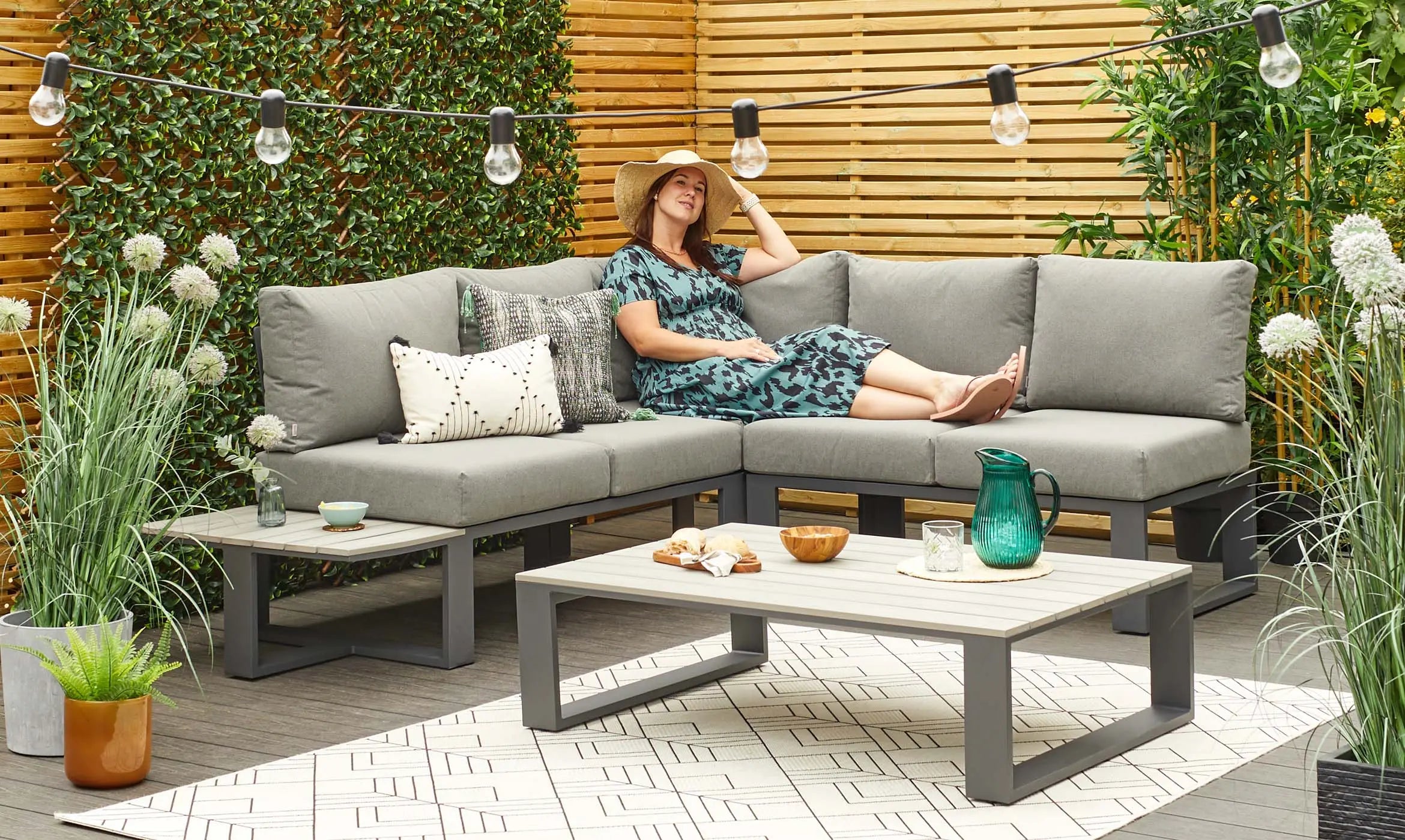 Styling Tips Georga West
A guide to styling your small garden
In modern life, many of us now have smaller gardens, but that doesn't mean you can't style it how you would like without making it practical. If you have a small garden but are unsure on how to style it, see our tips and recommendations from our stylist Katie for an aesthetic, yet practical oasis.Read More Interior Focus Georga West
Danetti Mattress Disposal Service
Take away the hassle of getting a new mattress and ask us to take away your old one when we deliver your new one. Find out how this service works and what happens to your old mattress.Read More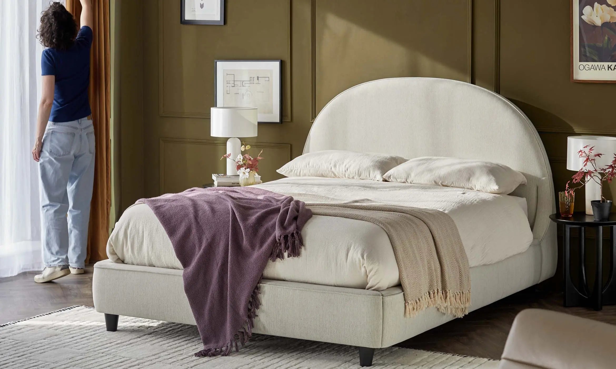 Interior Focus Georga West
Danetti's 2024 Spring Furniture Collection
2024 is the year for warm tones as well as soft line and textures in interior design; and spring is the time for breathing new life into your home. See our Spring collection to give you some inspiration.Read More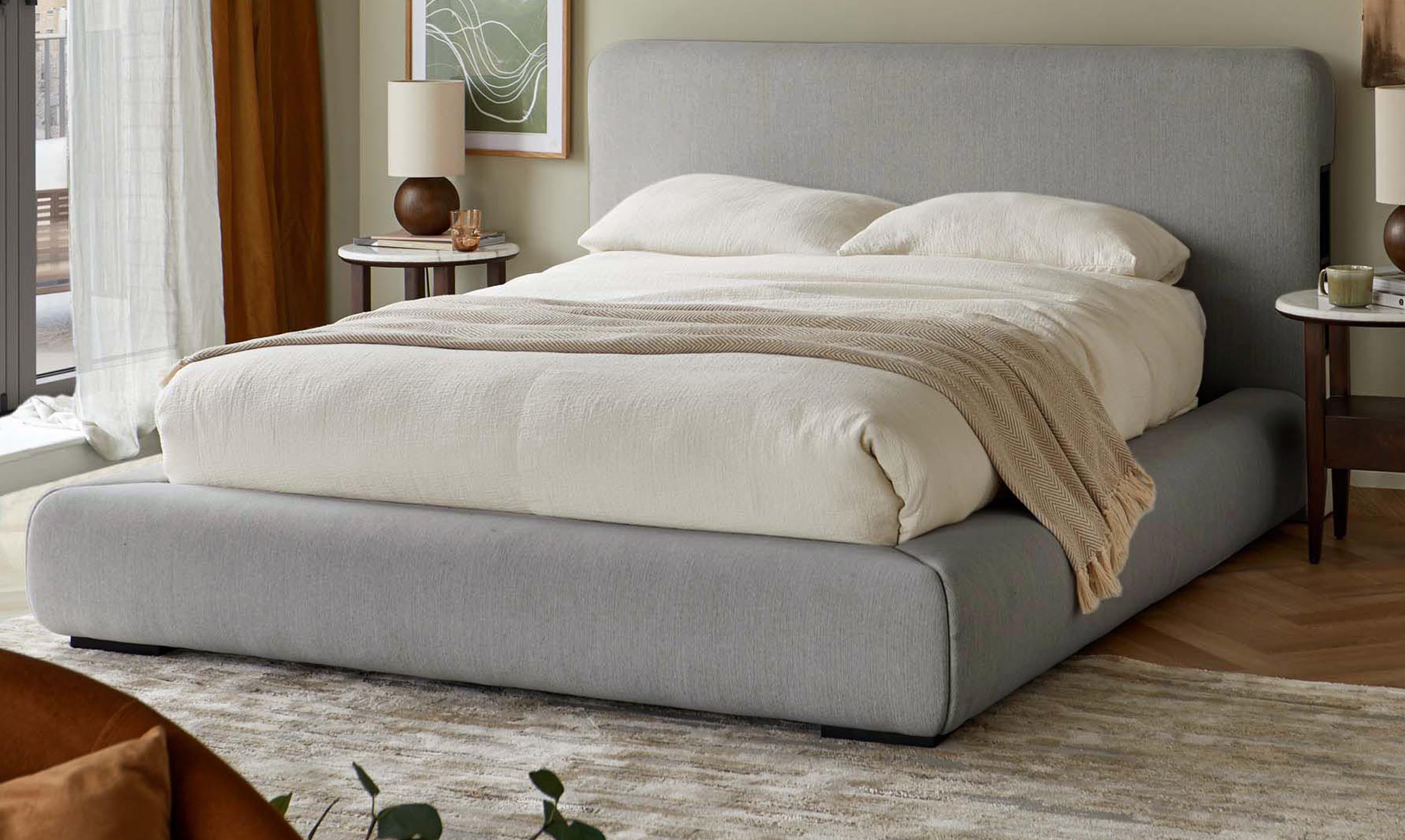 'How to' hub Georga West
Optimizing Small Spaces: Creative Bedroom Furniture Solutions
The bedroom is a sanctuary for many, but can also be the place that is tightest of space and which gets the least attention when it comes to aesthetic appeal. In this guide we recommend multipurpose furniture pieces which can help you make the most of your bedroom space and to give your room a modern finish.Read More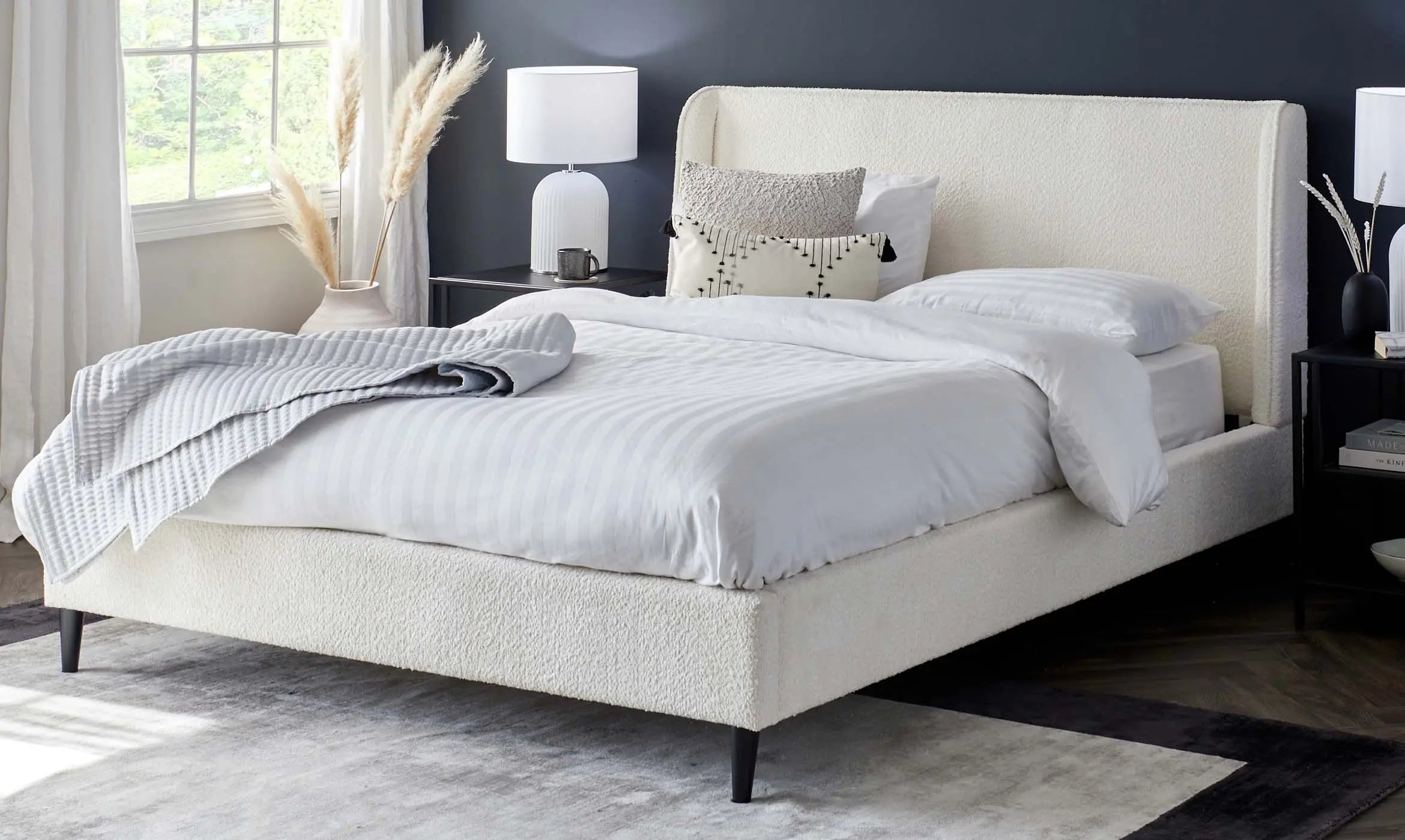 Styling Tips Georga West
Embrace Modern Elegance: A Guide to Styling Your Bed in Contemporary Fashion
Bedrooms can often be tight for space and so hard to style for a contemporary look. Check out our blog on how to style your bedroom for a modern look.Read More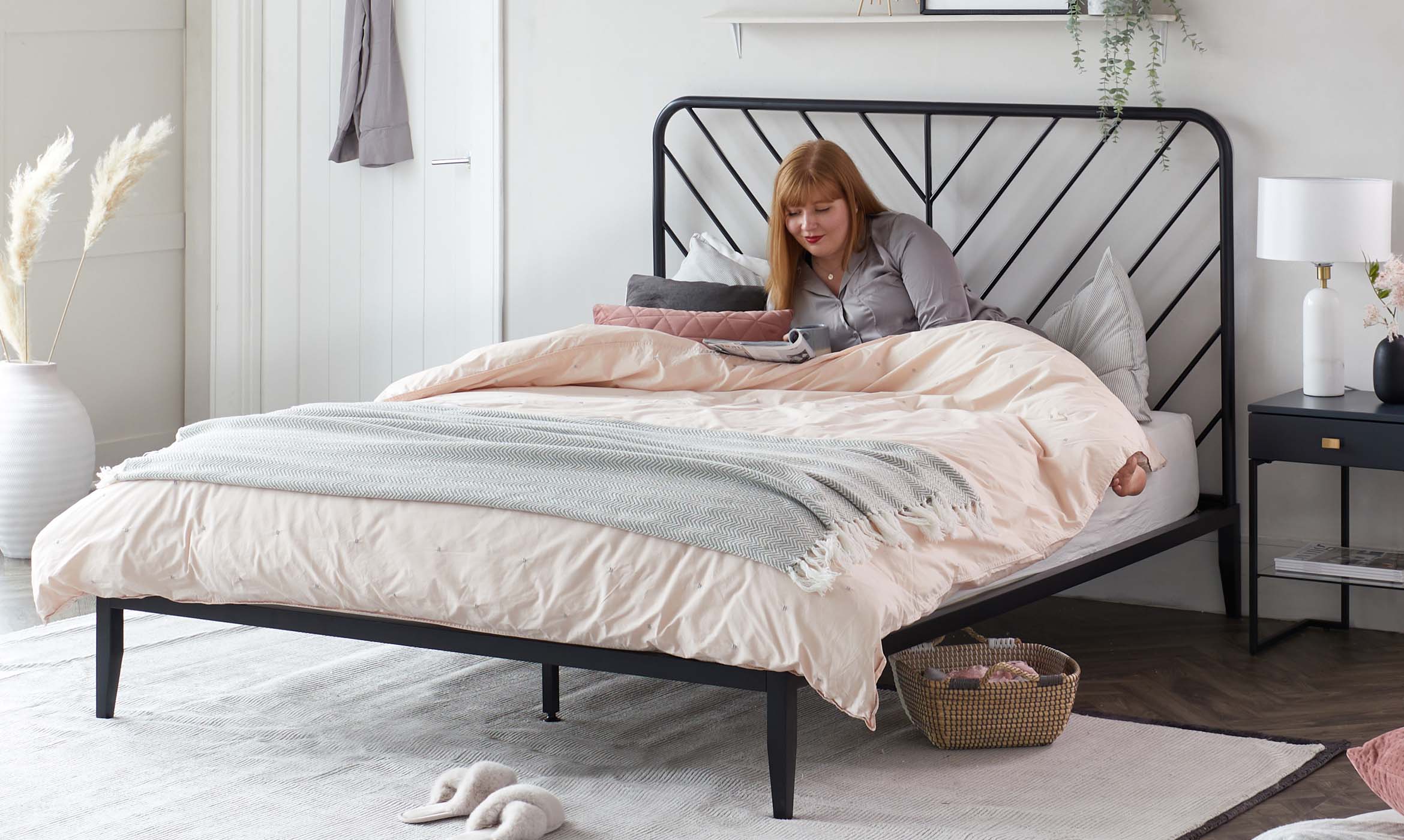 'How to' hub Georga West
Create Your a Modern Bedroom Aesthetic with Contemporary Metal Beds
Metal beds are making an impact on bedroom interiors at the moment, so find out exactly why a metal bed could be a good choice for you.Read More 'How to' hub Georga West
Top Interior Trends 2024
Uncover what Danetti bets to be the top trends of 2024. Think warm tones, soft lines and cosy textures for a welcoming home.Read More Trending Georga West
Pantone's Colour Of The Year 2024: Peach Fuzz
Learn about 2024's Pantone colour of the year - Peach Fuzz - and how this will impact interior trend this year, plus tips on how to style with it.Read More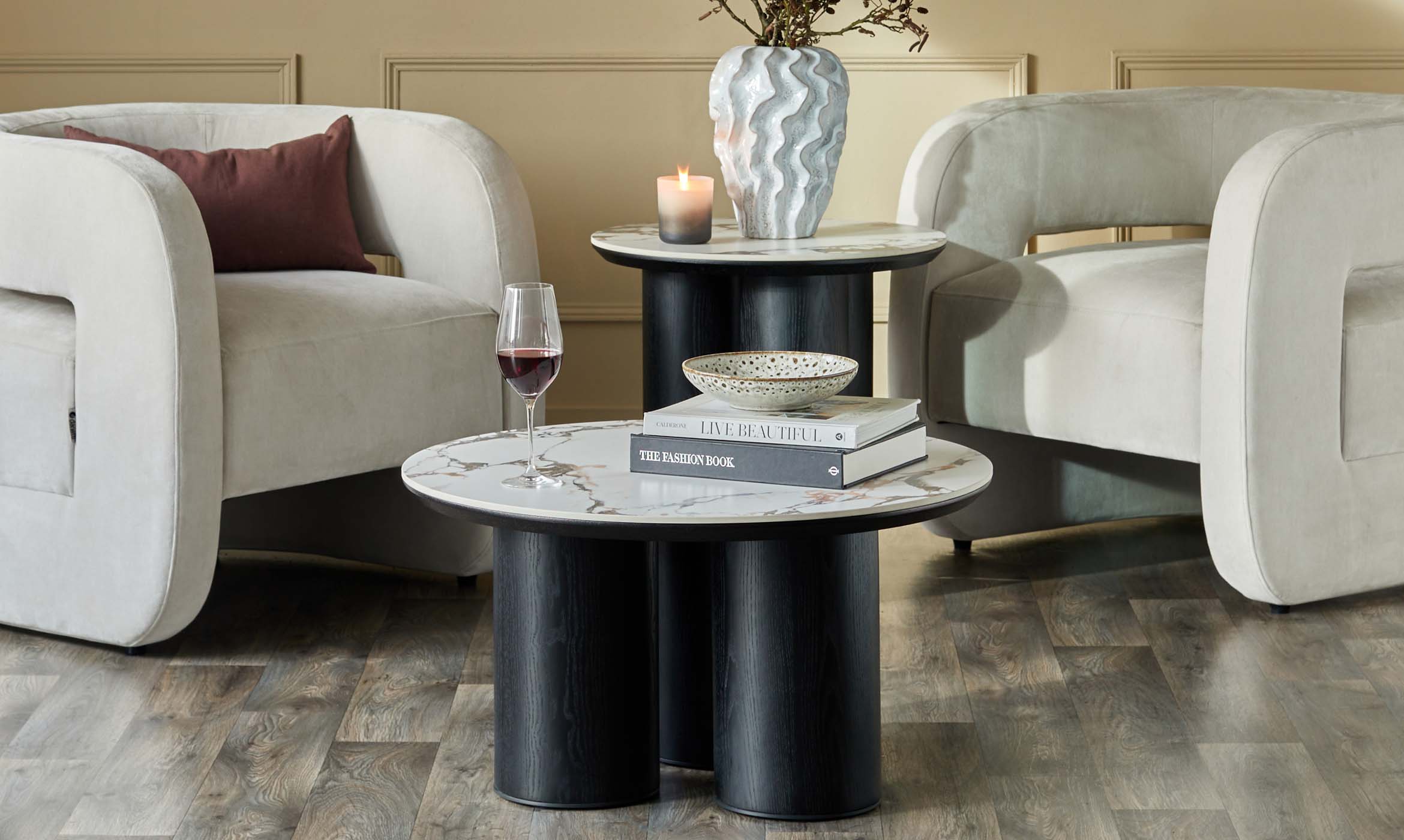 Styling Tips Francesca Perryman
Modern Coffee Tables: 4x Things You Need To Know When Styling
Our expert stylist, Katie, has shared her top styling tips and interior knowledge so that you’ve got all the info you need to find the perfect coffee table for your space.Read More Buying Guides Francesca Perryman
4 Things You Must Know About Leathers Sofas
Our expert stylist, Katie, has shared her top styling tips and interior knowledge so that you’ve got all the info you need to pick leather sofa of your dreams.Read More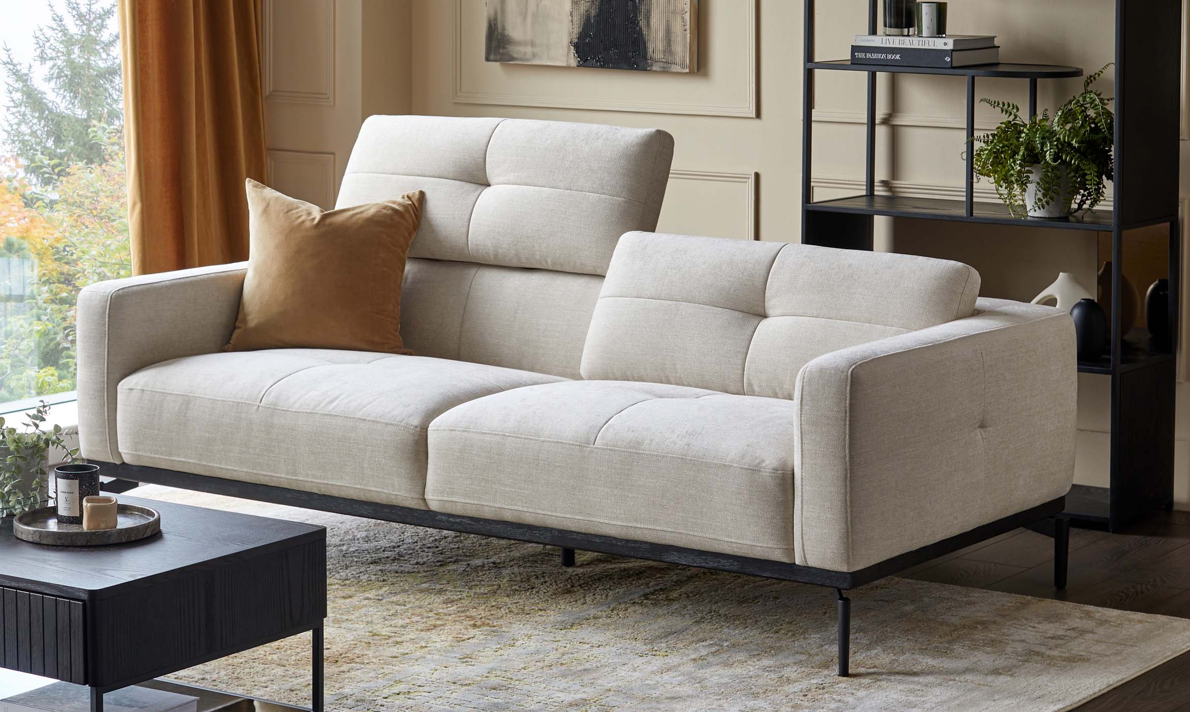 Buying Guides Francesca Perryman
5 Things You Must Know About Fabric Sofas
Are you wondering what the benefits of a fabric sofa are? Our expert stylist, Katie, has shared her top styling tips and interior knowledge so that you’ve got all the info you need to pick the fabric sofa of your dreams.Read More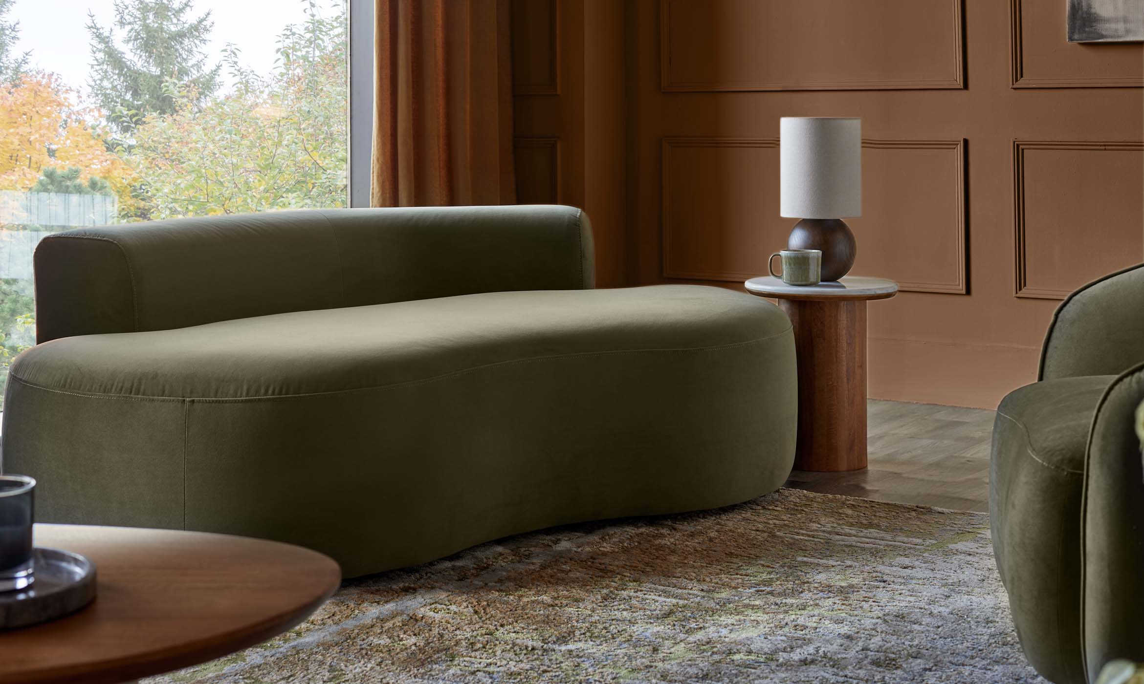 'How to' hub Francesca Perryman
How To Clean A Velvet Sofa: Our Upholstery Care Tips
A common misconception about velvet is that it’s a high-maintenance material. Well, let us bust that myth with this handy care and cleaning guide! When treated with the proper care and maintenance, you’ll find your velvet furniture is built to last.Read More Trending Francesca Perryman
World Cup Home Bar Ideas
It’s Coming Home – in every sense of the word! Make your World Cup experience even better with your own home bar set up. With a fully stocked drinks cupboard, who would want to leave the house?Read More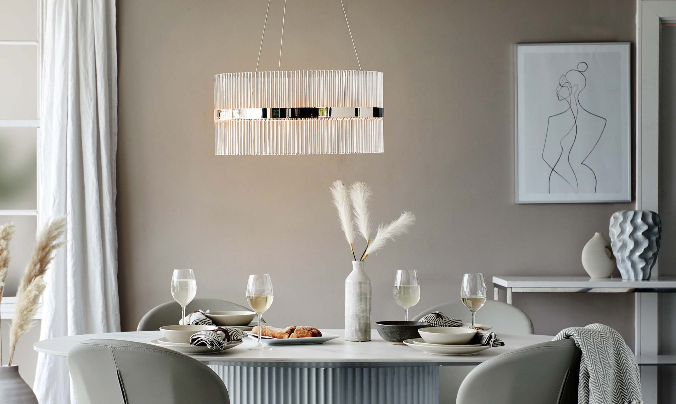 Trending Francesca Perryman
Luxury Design: 4 Things You Need To Know About Luxury Interior Design
Dark tones, rich textured finishes and opulent fabrics – this season, it’s all about making your home feel elegant and luxurious. One of the biggest trends emerging in interiors is the idea of ‘Considered Luxury’.Read More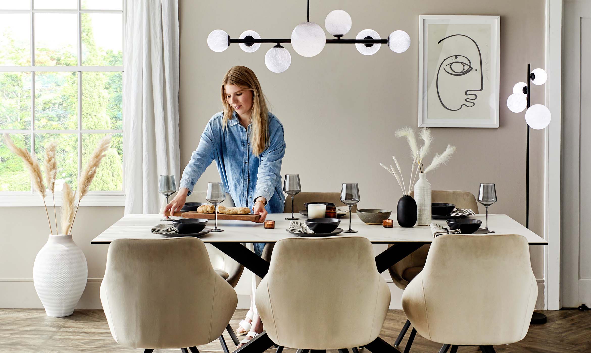 Buying Guides Francesca Perryman
Lighting Trends: 4 Things You Need To Know About Our New Collection
New to Danetti and inspired by our five-star rated furniture ranges, we’ve curated our very own exclusive collection of lighting that’s perfect for enhancing any room in your home. We sat down with Danetti Buyer, Julie, to discover more about this unique collection.Read More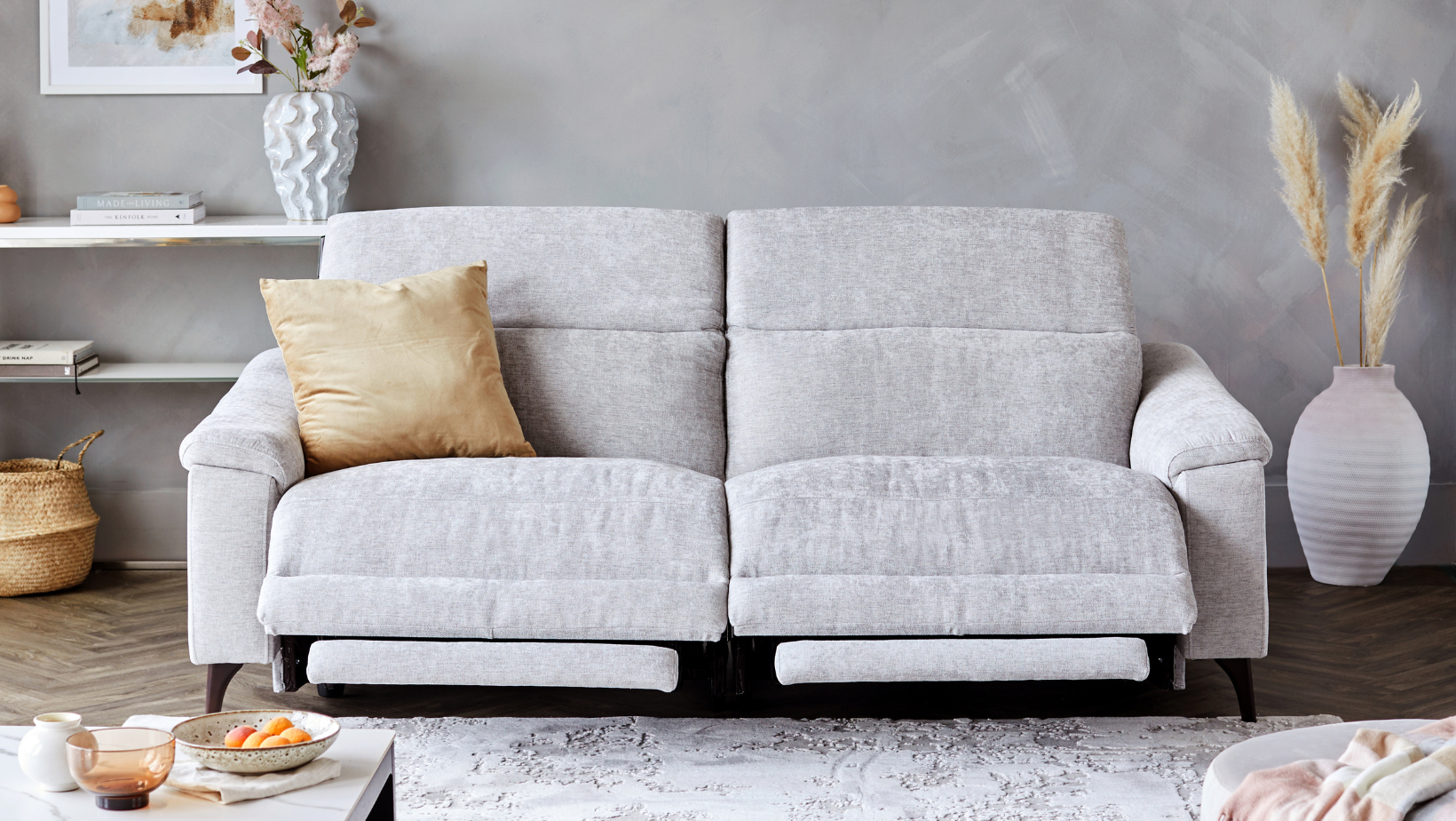 Buying Guides Francesca Perryman
4 Things You Need To Know About Interior Trends This Season
Soft weaves, sweeping curves and rich textured grains are all the trend this season when it comes to interiors. We sat down with Danetti Designer, Damien to discover more about this season’s need-to-know tips.Read More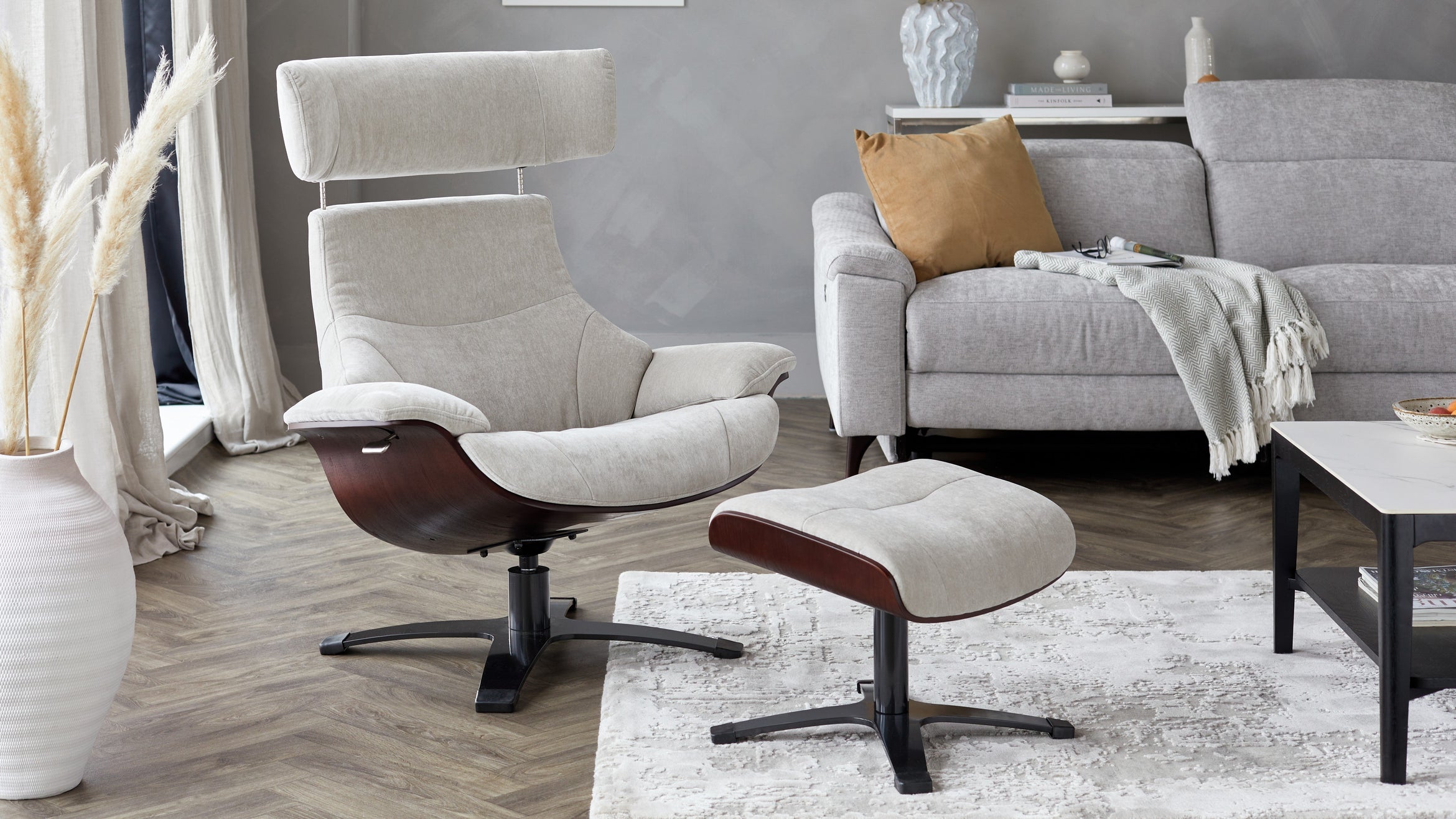 Buying Guides Francesca Perryman
Relaxing Interior Design: 3 Ways To Create a Relaxing Space at Home
Soft and neutral palettes, soothing fabrics and textures, and subtle signature detailing; it’s the perfect interior recipe for creating a home that feels like a sanctuary. We sat down with Danetti Designer, Francesca, to discover how you can easily create an aesthetic that feels comfortable, warm, and cosy.Read More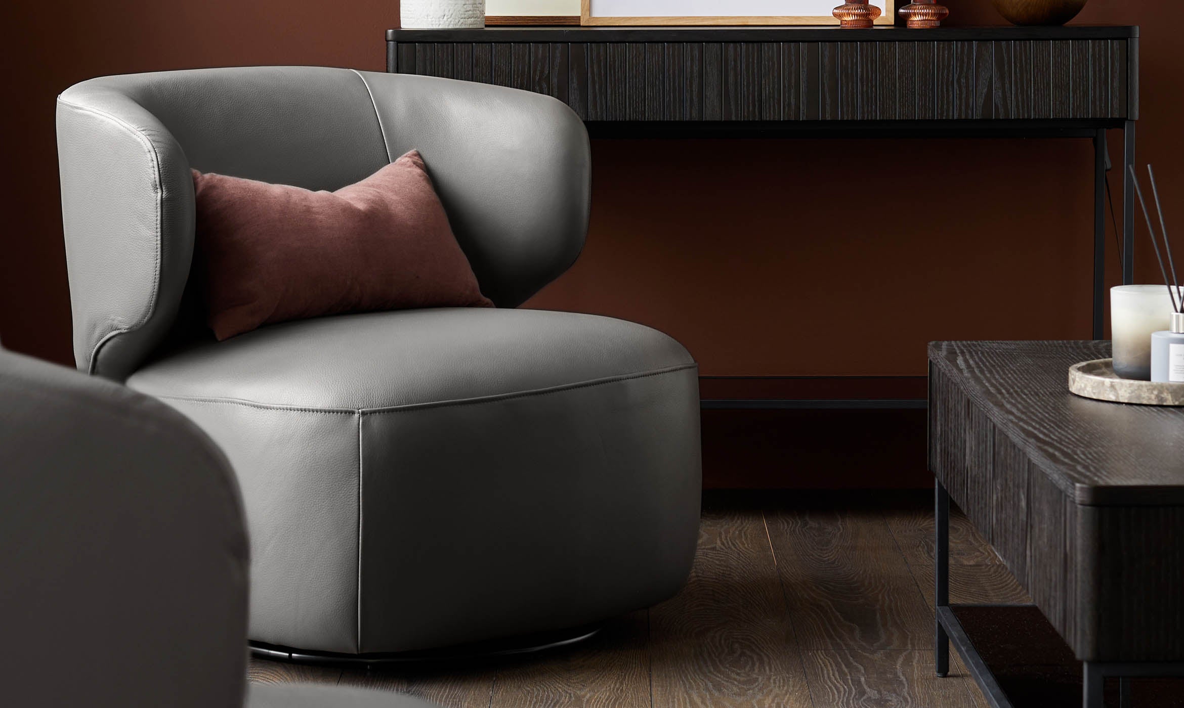 Buying Guides Francesca Perryman
Armchairs and Accents Chairs: How To Style Your Occasional Chair
Create your own reading corner, bring a cosy feeling to your living space, or add character to your bedroom with our collection of accent chairs and occasional chairs.Read More Buying Guides Francesca Perryman
Cool Cocooning: How To Bring Earthy Colours Into Your Home
From turning your bedroom into a soothing sanctuary, to creating a living room with soft and earthy colours that’s perfect for escaping to and relaxing, the design concept - cocooning - is all about turning your home into a serene space.Read More Trending Francesca Perryman
Neotenic Design: How To Bring This Interior Style Into Your Home
The list of trends influencing the world of interiors this season is filled with unique styles. Here’s all you need to know about an unusual trend that’s sweeping homes across the globe.Read More Trending Francesca Perryman
Maximalist Décor: 5 Things You Need To Bring Maximalism Into Your Home
Bold and bright colours, vivid patterns and ample accessories – more is more when it comes to maximalism. In the world of interiors, this trend is all about having fun and playing with those elements that make a space feel like home.Read More Styling Tips Francesca Perryman
Summer Home Styling Tips: 5x Ways To Transform Your Home This Season
From adding personality to your garden, to turning your bedroom into an airy sleep sanctuary, discover how you can curate a home look that’ll see you through the season but keep you cool and comfortable this summer.Read More Interior Focus Francesca Perryman
What is Escapism in Interior Design? All You Need To Know
Boost your mood as soon as you return home with the interior design trend, Escapism. More than ever before, people are wanting to create a space where they can embody that ‘staycation’ feeling of bringing the outside in and creating an extension of their interior in their garden.Read More Styling Tips Francesca Perryman
Multifunctional Spaces: Here’s What You Need To Know About Multifunctional Interior Design
Effortlessly stylish and modern furniture that’s easy to adapt with your needs and your space; this season has seen a shift in interior design with the need for multipurpose pieces that can transform with you and your home.Read More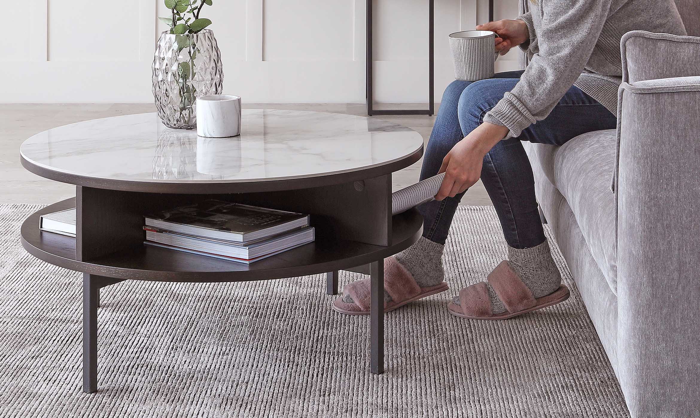 Interior Focus Francesca Perryman
Our Product Design Process: The Danetti Difference
When we design a product at Danetti, we always consider how the item will make customers feel once they bring it into their home. We sat down with one of our Designers, Francesca to get a whistle-stop tour on what goes into the creative process for Danetti furniture.Read More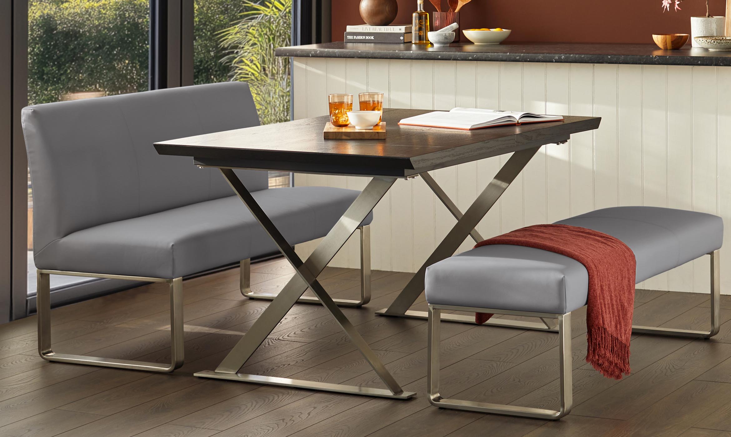 Interior Focus Francesca Perryman
Interior Design Insights: 3x Things You Need To Know
Whether you’re curating a space that’s luxurious and vibrant or cool and calming, furniture is going to play a huge part in how you bring that look and feel to the space and tell a style story.Read More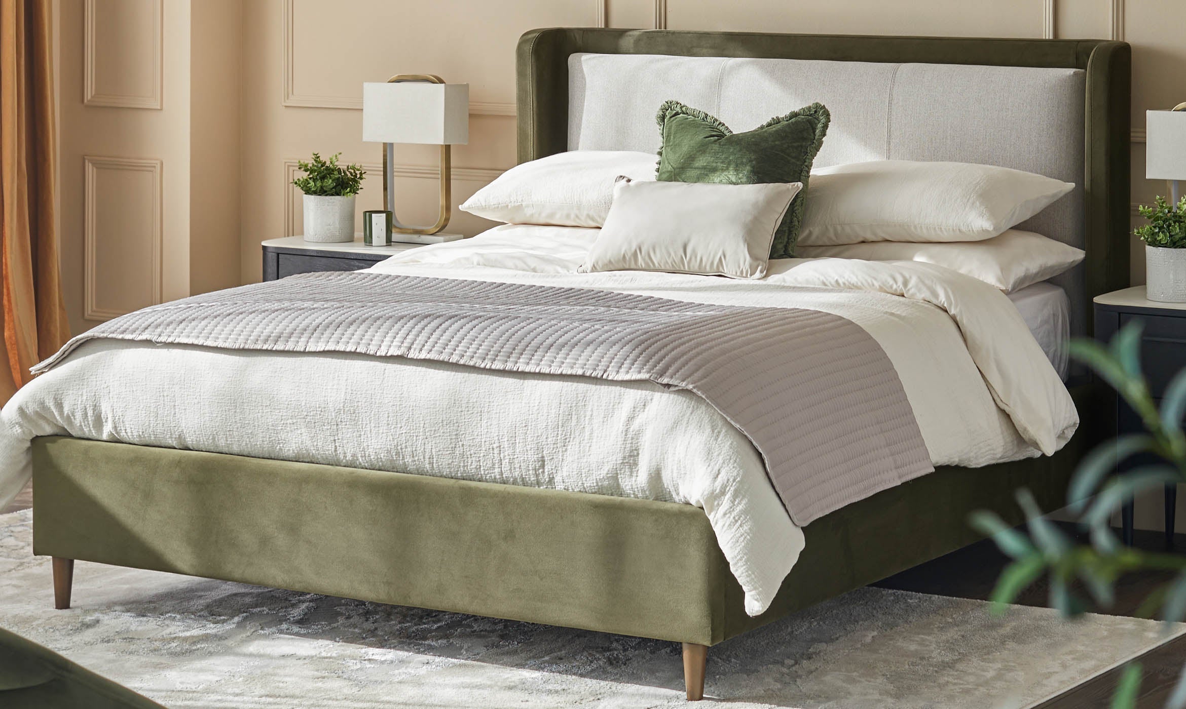 Trending Francesca Perryman
Bedroom Trends: The Close Up On Our New Collection
From a cool and calming neutral fabric finish to a gorgeous sage green velvet, our new bedroom collection is all about tones and textures that will help soften your room and turn it into a sleep sanctuary. Our Bedroom Buyer, Kelly, shares her exclusive insight into this season’s new collection: ‘Timeless Textures’.Read More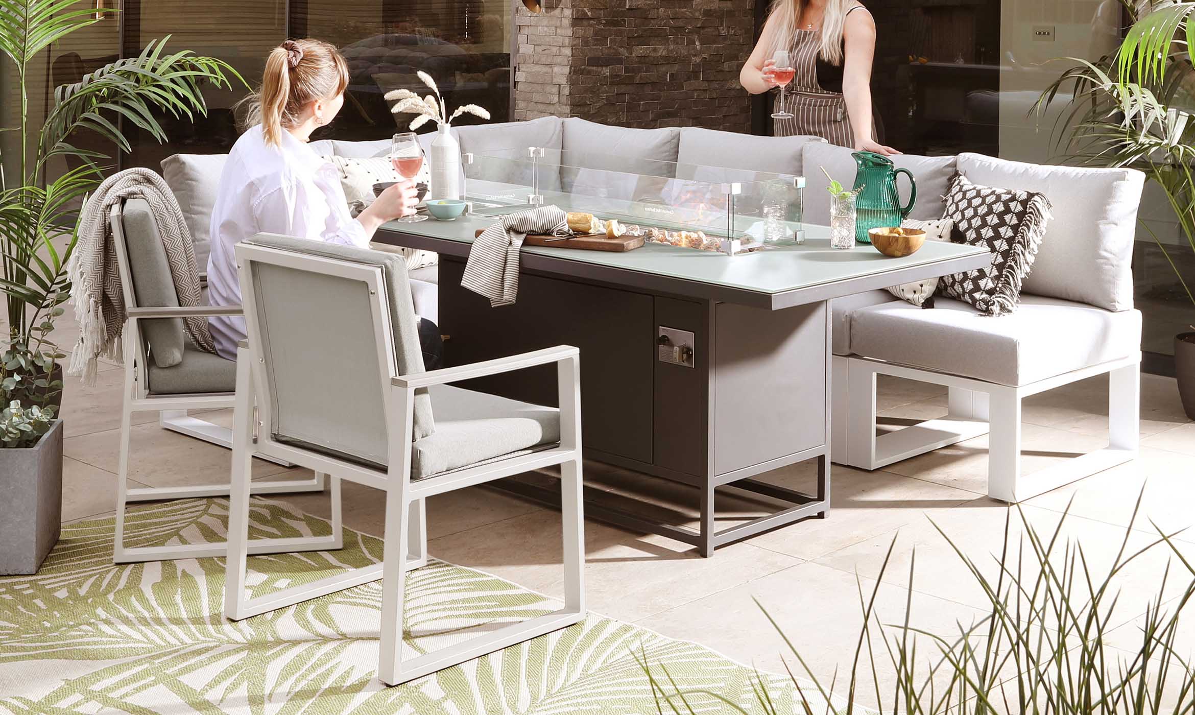 Trending Francesca Perryman
Garden Trends: The New Collection Close Up
We sat down with our Garden Buyer, Kelly, to look at how these new garden furniture pieces will help you to enjoy that holiday feeling from the comfort of your own outdoor space.Read More Trending Francesca Perryman
Japandi Interior Design: All You Need To Know About This Home Style
Japandi fuses the comforting, warm colours of Scandinavian design with the sleek, minimalistic elegance of Japanese design. Here’s all you need to know about this style of interior design and how you can curate this look and feel in your home.Read More


