Skip to content


Have you ever wondered why we make certain decisions based on colour? Seeing colour is a physical response, but many of us are unaware that colour can directly affect the part of our brain associated with our metabolism, sleeping pattern, behaviours, and appetite by triggering an emotional response.
Colour is a key player when it comes to interior design as your chosen colour scheme sets the mood for your space. For example, neutral palettes have been known to have a calming effect, whereas bright and bold reflects energy and liveliness. Similarly, colour is also used to add elements of your personality to a space – truly making it a haven for ‘you’.
How has the history of colour and design affected our experiences?
To answer this question, we need to travel 30,000 years in the past when early man began to use colour for decorative purposes in cave paintings. Colour has since been incorporated consistently in many civilisations like the Ancient Egyptians, the Greeks, and Romans to the present date.
Our response to colour derives from two main factors – nature and culture. We have learned to primitively associate certain colours with positive or negative connotations. For example, black and red when paired together are instinctively perceived as danger or warning signs, whereas the colour red individually is perceived as a symbol of wealth across many cultures.

How do we set the mood with colours in design?
How does this all relate to our homes? Well, according to Colour and Design Psychology Expert, Karen Haller, specialists often use colour psychology in their interiors to evoke desired feelings and behaviours like helping you reduce your stress or enhancing productivity.
Colour Expert and Interior Designer, Sarah Garanty, studied over 400 colours to identify the following trend collections:
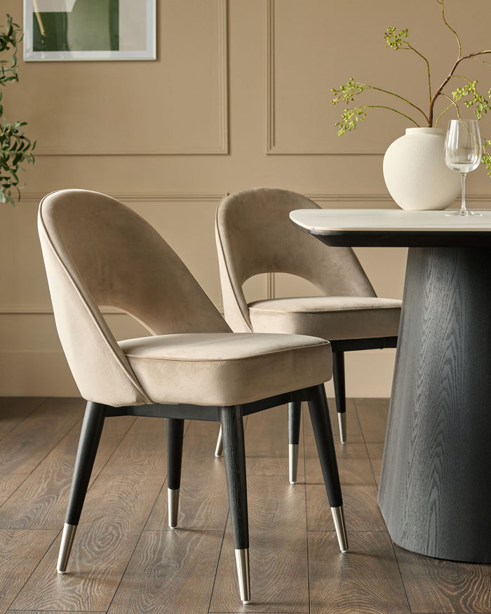
Uncluttered Wabi-Sabi
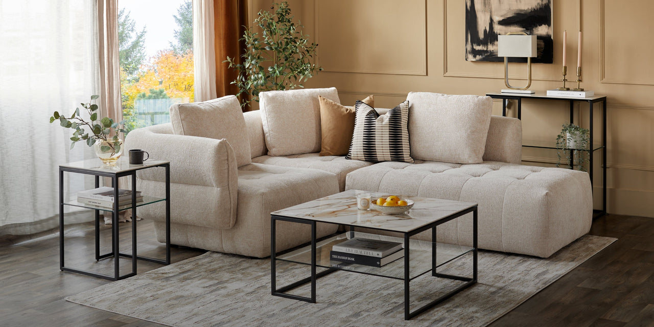
Derived from a Japanese trend, Wabi-Sabi is all about taking things back to simplicity. Colours like browns, beiges, and light greys can help create a calm atmosphere and give the feeling of peace, leading to an uncluttered mind.
Calm can also be accompanied with luxury with champagne velvet dining chairs that are easy on the eyes and gentle to our moods.
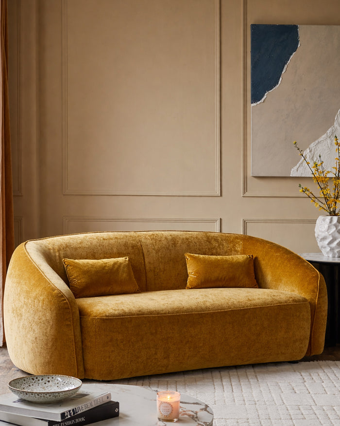
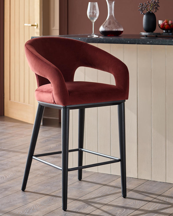
Calm Enclosure
Colours such as warm yellows and rich reds can be used to emphasise certain design elements in a way that is not overstated. A perfect example of this would be to use colourful bar stools, or colourful dining chairs to uplift and subtly energise a space, and give a brighter start to the day.
Our Designer, Francesca Birch says: “Adding pops of bright and positive colour that embodies a feeling of optimism is especially important for our well-being. Yellow is bright and cheerful and will uplift any room in your home when added into pieces like accent chairs and accessories.”

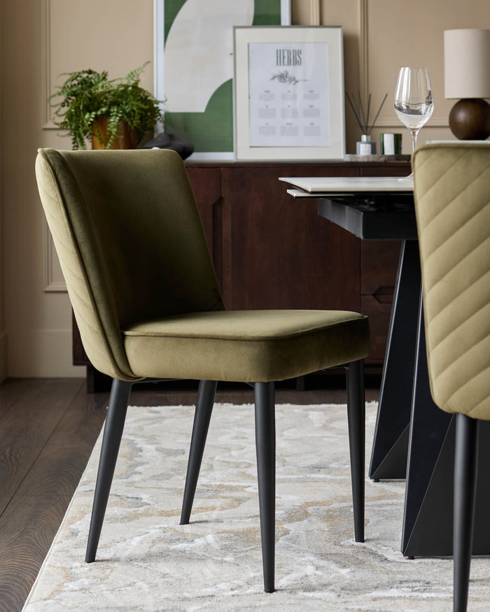
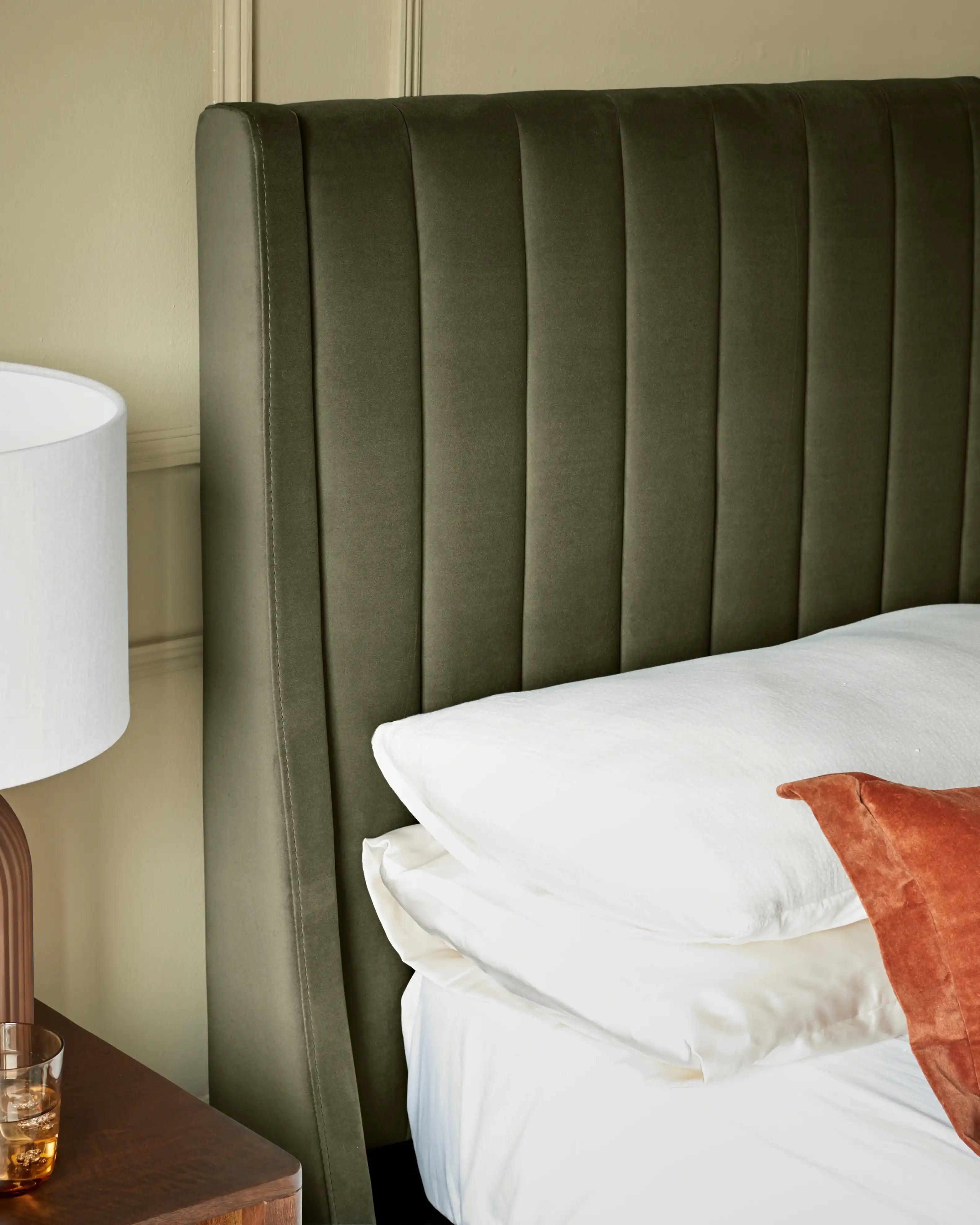
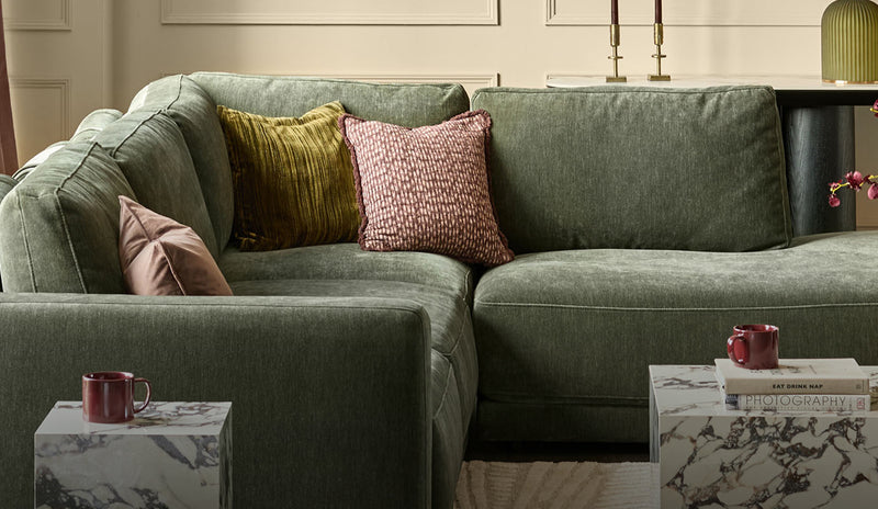
Biophilic Awareness
Green is the colour of balance and harmony between body and mind; its earthy hues help to keep us connected to nature. Adding elements of green to your space like a green velvet bed can promote a restful sleep environment with the comfort of soft velvet.
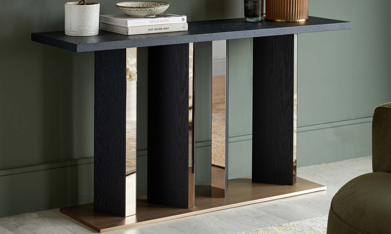
Technology
Described as the incorporation of human and artificial intelligence - this is a palette of clean chromatic blues, darker shades, and silvers. Multi-coloured dining table and chairs are an easy, elegant addition to capture this mood. What’s better? Shades of blue are known to influence focus and productivity positively so this sort of palette would work perfectly in a study or home office space.
When it comes to interior design, colour plays with our senses and sets the mood, directly affecting the world around us. This is why it’s important to pick a colour scheme that is right for you. Here are a few points to remember when choosing your colour scheme:
- Using colour psychology can help you set your desired mood in any room.
- The use of neutral colours such as brown, beige, and grey can visually declutter a space -reflecting a clean, and calm environment.
- Reds and yellows are known to subconsciously trigger positivity as they can be energising and empowering.
- Green is reflective of nature and has a calming effect if your goal is to induce better sleep.
- For a multi-purpose space, blues can enhance productivity by helping you reflect and focus.