Complementary Colours
Complementary colours are colours found on opposite side of the colour wheel. The Primary colours complementary colour is a combination of the other two Primary’s mixed together, for example:
Red complements Green – which is created through mixing blue and yellow
Blue complements Orange – which is created through mixing red and yellow
Yellow complements Purple – which is created through mixing blue and red
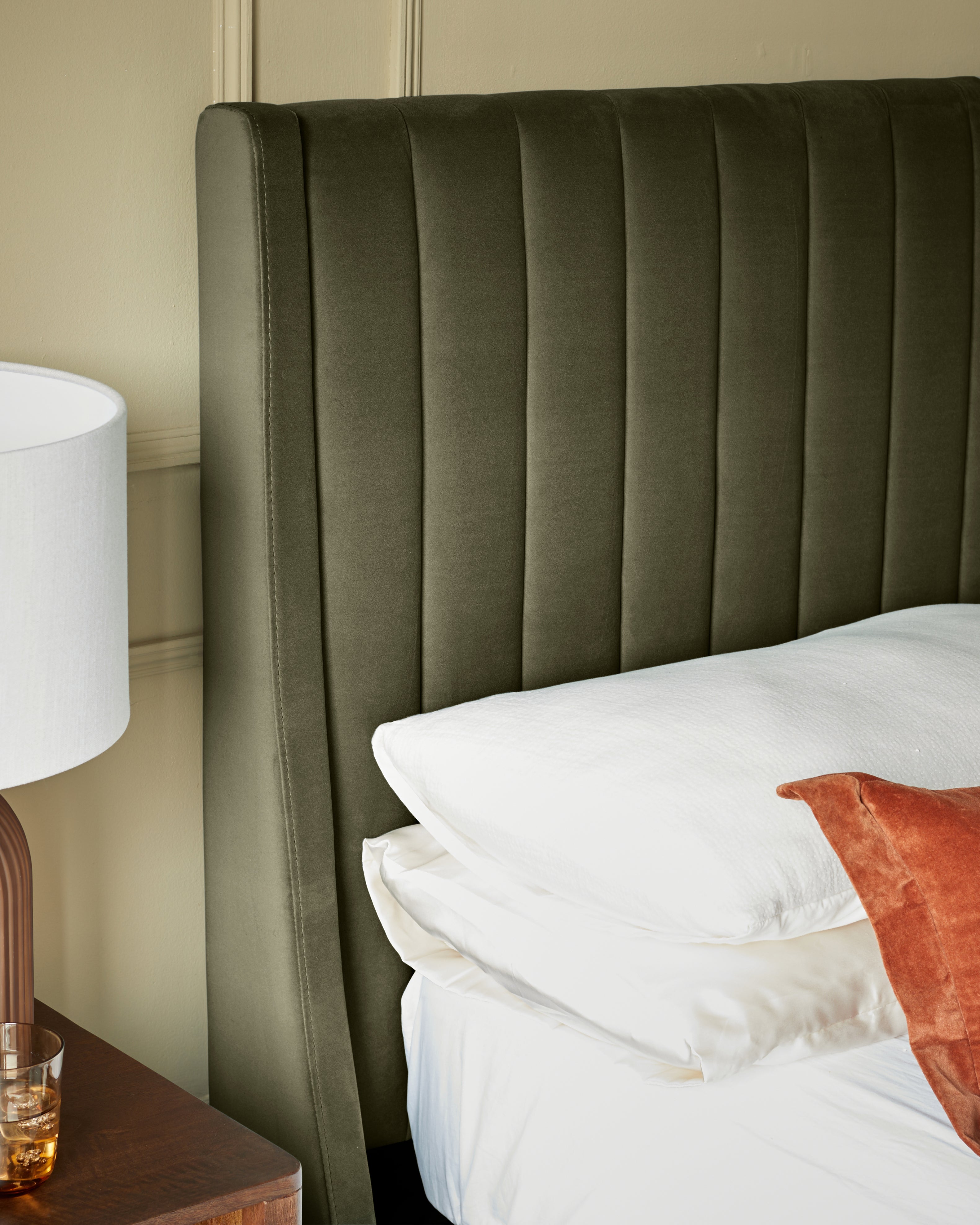
Complementary colours are important to recognise because if they are placed in a room next door to each other they will make the other seem brighter, creating the most contrast.
This can be exploited in your rooms, if you feel confident enough, or it can be a useful tip to know in order to avoid problems
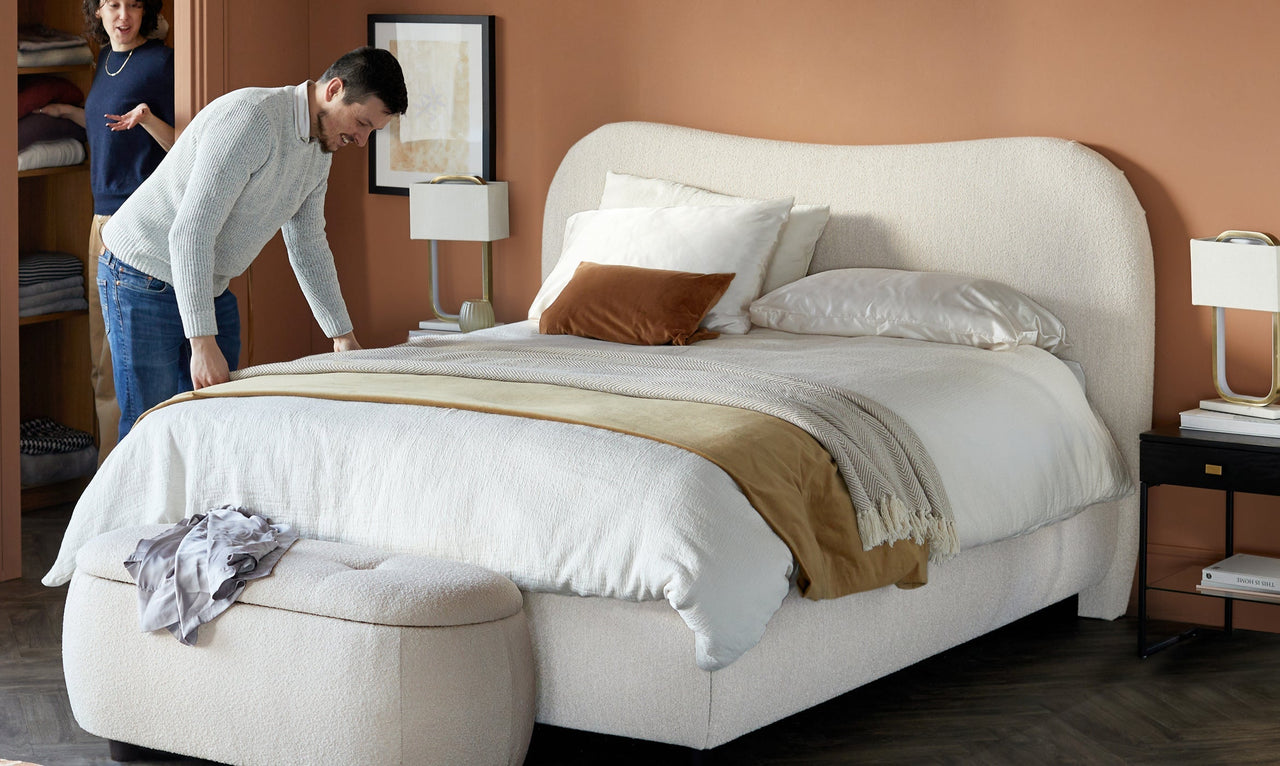
Monochrome - traditionally meaning one colour. However, you can include different tones of the same colour to stop the scheme seeming to monotonous. For example; should you choose the colour black, any of the different tones desaturating all the way up to white can be used, so this would include the whole grey tonal range (as long as it was exempt of all other colour).
Another way to add interest to a room when using a monochromatic theme is to introduce a variety of textures in that colour.
Analogous Colours
Analogous Colours are a collection of colours found adjacent to each other in the colour wheel, one of which is normally a primary colour (red, yellow or blue).
When using an analogous range of colours, one is normally dominant while the others can be varied in intensity to create a myriad of different variations.
Tip : If you are having problems putting colours together, look to nature. Everything in nature has perfect harmony and balance, you will never go to wrong if you use that as a basis for choosing your colours.
Split Complementary
Split Complementary is a variation of the complementary colours, except this uses one of the complementary colours and the two colours adjacent to the opposite complementary.
For example : yellow and purple blue and purple red (as above)
This provides similar colour contrast to the standard complementary colours but without the tension.
This could be a more viable option in comparison with the complementary colours as you can still achieve a high contrast, but with a smaller chance of creating major issues. Its always worth remembering that these colours should not be used in equal measure and to their full saturation. To get the best effect one should be most dominant and they should range in saturation/brightness.
Triadic Colours
Triadic Colours are three that are equal distance around the 12 segment colour wheel.
For example : yellow orange and blue green and red purple (as seen above)
With this scheme one colour is normally used as a dominant, whilst the other two are accent colours. These trios of colour are considered to be more harmonious and balanced than the complementary colours and are a popular choice amongst artists.
Again once the main colour is chosen it should feature the most in the room with the other two colours used sparsely, like on cushions, a vase, a rug etc.
Tip : By using accessories to display the accent colours it also means should you want to update later on, you can easily replace them to give the room a whole new feel, providing not only a cheap option but a quick one to.

