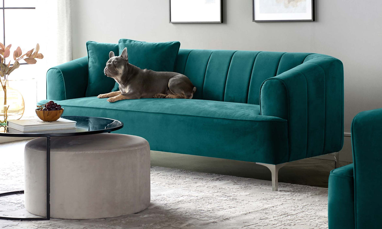
How to use Heartwood, Dulux 2018 Colour of the Year in Your Home
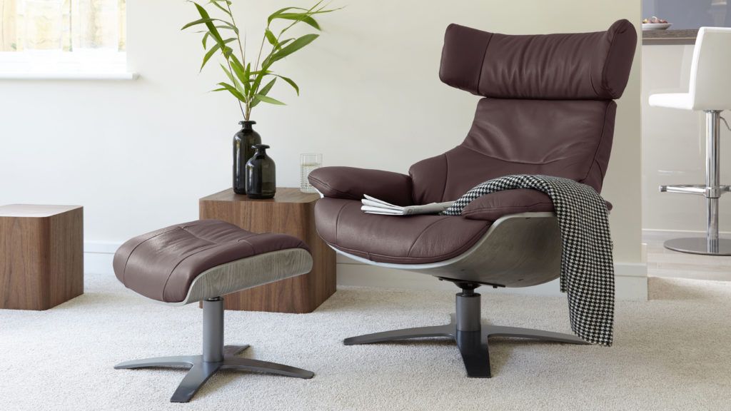

All images via Pinterest.
Heartwood is “a beautiful warm neutral with a hint of heather”, as described by Dulux. In these modern times, we all need a bit of nurturing, which is exactly where this dusky pink colour comes in. When used throughout the home we evoke feelings of warmth, calmness and nature. Think early, chilly mornings watching the sun creeping out from behind Britain’s beautiful rolling fields. Having said that, we are well aware that not everyone has the same interior style, which is why we have created 4 different looks all using Heartwood. Showing you just how simple and versatile this colour really is.
Look 1: Warm Monochrome

Who doesn’t love monochrome interiors? A simple greyscale colour palette suits any style, be it modern and contemporary or vintage-inspired interiors. The use of Heartwood in this colour board really softens the stark contrast between black, white and grey. Plus, by playing up the harmonious colours of heather and graphite grey, we manage to take a flat colour combination and turn it into a soft and serene look.
To give this look a modern update, we’ve gone for a more contemporary finish, Black Chrome. This is the freshest in modern interiors and adds a real high end, designer feel to any home- without the designer price tag! You can check out our full range of Black Chrome products right here.
Get The Look:
Mellow Bench with Backrest in Graphite Grey
Black Chrome Elise Dining Chairs in White
Black Chrome Elise Bar Stools in Graphite Grey
Karma Occasional Chair in Heather and Light Wood
Look 2: Purple Haze

Heartwood has subtle undertones of purple, meaning the other colours used in your home interiors can change the way this shade looks. The use of grey tones will result in a cooler Heartwood. However, balance with warmer neutrals and other shades of purple, and we pull out the true heather tones. This mood board plays on this trick of the eye, by warming up with oatmeal and our favourite mulberry purple. Work a hint of brass into your home accessories and you have a luxurious, opulent colour palette.
However, be sure to keep your neutrals grounded with grey undertones. Cream tones can make Heartwood feel too sweet, which we don’t want- grey tones will keep it mature and sophisticated. You can also create a real statement by using a bold wallpaper in a complementary colour, such as the one featured in our mood board, from Feathr.
Get the Look:
Assi Walnut Extending Dining Table

Baltic Seal Wallpaper from Feathr.
Ripple Glass and Brass Coffee Table
Look 3: Cool Hue

When we think about the science behind the colour wheel, we know neighbouring colours sit well together as they create a harmonious feel. So what better colour combination for Heartwood than cool blues. We’ve chosen a powder blue to avoid this look feeling too dark, however, if you are feeling brave, you can substitute lighter shades for navy and midnight blues for a real moody look. Balance out bold colours with different shades of grey, to keep your interiors modern.
To avoid this colour combination feeling too young, play around with textures. Mix brushed steel with chrome, and balance velvet with marble. It’s these luxury details that will bring this look to life and give you a home to be proud of.
Get the Look:
Cross 4 Seater Dining Table in White Gloss
Form Dining Chair in Graphite Grey
Pebble Side Tables in Powder Blue
Acute Console Table in Grey Gloss and Chrome
Look 4: Modern Opulence

We all know that colours trends come and go, with each season bringing new styles and accents colours. And sometimes we just don’t have the time, funds, or willpower to paint our homes constantly. In which case, it’s a good idea to keep your home neutral and play around with soft furnishings and textures. Our last mood board is a very subtle, classic and simple look.
Keep your investment pieces (such as sofas, dining tables and flooring) neutral and timeless. Oak floors and tables along with grey walls are always a safe choice. Once your key pieces are in place, you can play around with quick, cost-effective seasonal updates. Side tables and stackable dining chairs are a great choice to refresh more regularly, as these tend to be slightly cheaper and can dramatically change the look and feel of a room.
Get the Look:
Oak Sanza Extending Dining Table

Tori Stackable Dining Chair in Light Cream
Ellis Real Leather Armchair in Heather
Elise Gas Lift Barstool in Light Cream
What's your interior style?
Now you’ve seen our styling and decorating tips for using Heartwood, Dulux’s 2018 colour of the year, let us know what you’d choose. Be it dark and moody hues or bright and colourful interiors. Just be sure to remember these top tips;- Stick to neutral colours in your investment pieces of furniture, and play around with your soft furnishings. Trends come and go!
- Choose colours with grey undertones to keep your interiors sophisticated and like the pages of your favourite interior magazines. This will stop Heartwood feeling too pretty and girly.
- Play up textures in your interiors. Hard materials, such as marble, balanced with velvet, and brushed metals with a high gloss dining table.
- Choose a bold wallpaper in complementary colours to really show off your interior style.
- Brass accessories will warm up your dusky heather walls, where chrome or black chrome will keep it cool and super stylish.
Like our suggestions? Why not share with us how you would use Heartwood in your home, and show us your pictures by using #mydanetti across Facebook, Instagram and Twitter!
Publish Date: November 2017
Don't miss a thing
Simply enter your email address below and stay up to date with our latest news and products.
Explore Our Blogs
 A guide to styling your small gardenIn modern life, many of us now have smaller gardens, but that doesn't mean you can't style it how you would like without making it practical. If you have a small garden but are unsure on how to style it, see our tips and recommendations from our stylist Katie for an aesthetic, yet practical oasis.Read more
 Modern Coffee Tables: 4x Things You Need To Know When StylingOur expert stylist, Katie, has shared her top styling tips and interior knowledge so that you’ve got all the info you need to find the perfect coffee table for your space.Read more
 4 Things You Must Know About Leathers SofasOur expert stylist, Katie, has shared her top styling tips and interior knowledge so that you’ve got all the info you need to pick leather sofa of your dreams.Read more
 5 Things You Must Know About Fabric SofasAre you wondering what the benefits of a fabric sofa are? Our expert stylist, Katie, has shared her top styling tips and interior knowledge so that you’ve got all the info you need to pick the fabric sofa of your dreams.Read more
 How To Clean A Velvet Sofa: Our Upholstery Care TipsA common misconception about velvet is that it’s a high-maintenance material. Well, let us bust that myth with this handy care and cleaning guide! When treated with the proper care and maintenance, you’ll find your velvet furniture is built to last.Read more


