

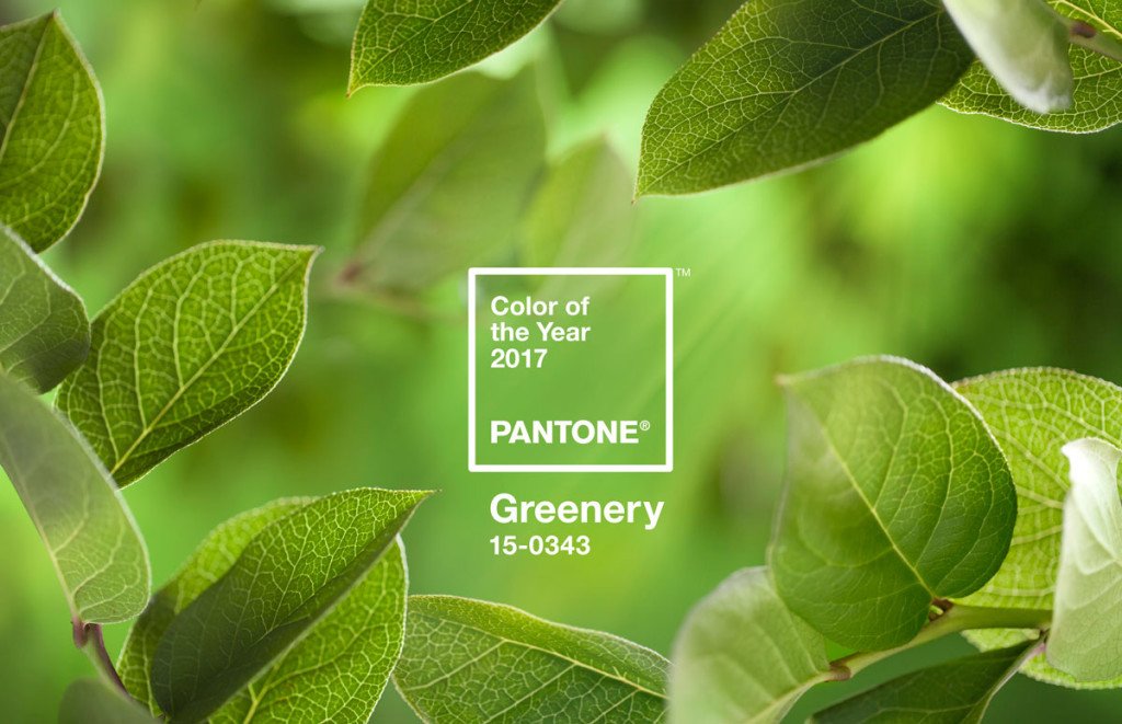
Pantone’s Colour of the Year 2017 is…. Greenery
It’s a really exciting announcement and it is always interesting to find out the reason for it. Especially the psychology behind the chosen colour and how it’s come about. So, as the announcement day draws closer, here at Danetti we wait with anticipation to find out what the top colour experts at Pantone HQ have come up with for us this year.

Greenery
Last years duo combo of Serenity and Rose Quartz was very refreshing, highly sensitive and topical. A re-affirming of gender equality and how each colour blended into the other. It was a colour choice triumph! (for more info click here to read last year’s post). So what did they have in store for us this year? Well, this years colour of the year is Greenery…and it didn’t initially draw quite the gasp last years did. There was even, dare I say, an air of disappointment.
But quite quickly Greenery has begun to grow on us. If you look at it properly it has a zingy, spring freshness that does evoke feelings of hope and new beginnings. Which is perhaps what we all need after a fairly turbulent year of politics etc.
This is a fresh and zesty yellow green shade that literally smacks of Spring. It is a revitalising shade of green that makes you feel as if this colour Greenery is a symbol of nature. All the while reminding you of forests, grass, buds, botanical plants and breathing in fresh air.
So how do Pantone feel about the colour and what does it symbolise?
“We know what kind of world we are living in: one that is very stressful and very tense,“ said Leatrice Eiseman, the executive director of the Pantone Color Institute. “This is the color of hopefulness, and of our connection to nature. It speaks to what we call the ‘re’ words: regenerate, refresh, revitalize, renew. Every spring we enter a new cycle and new shoots come from the ground. It is something life affirming to look forward to’.
Well! When put like that, you realise that this colour is therapeutic and could be used to great effect in our homes. Creating a calming, tranquil environment away from the hustle and bustle of everyday life.
“There’s a Japanese concept called ‘forest bathing,’ which says that when you are feeling stressed, one of the best things to do is go walk in the forest,” Ms. Eiseman said. “But if you can’t do that, what can you do? Bring green into your environment. Put it on your body, or in your house or near your desk. That symbolic message is very important.”
(I think I could definitely learn a thing or two about Greenery from Ms Eiseman….the colour is literally growing on me as I write).
As a company immersed in the furniture industry and all aspects of design, we spend months researching and forecasting style and colour trends. Happily we did see the ‘green’ thing coming, but perhaps as a furniture company we were really swayed more towards the more flexible Forest Green.

‘In the last 12 months we’ve seen a move towards darker, more powdered colours featuring both blue and green quite heavily. All out green, in an interiors context, hasn’t always been that mainstream. Although this green is maybe more acidic than we were expecting, I think the message from Pantone is, as last year, perhaps the most relevant. You can interpret their ‘re’ words however you wish to bring a fresh approach to how you use colour. If you look at the colour pairings Pantone at you can see how versatile this colour can be. My favourite of all hues is ‘Tree Top’ from the ‘Transitions’ palette’
Sarah Inwood, Product Developer, Danetti
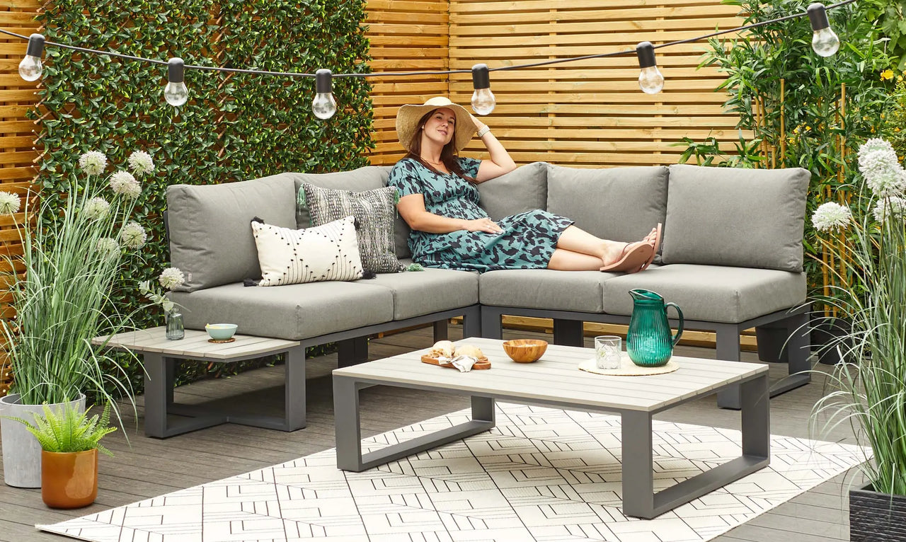
Pantone put the colour out there to be a symbol. This year’s colour of the year. But there is always a chart of other colours it sits well with. So we’ve chosen our favourite green products that would sit well with Greenery! Hopefully this will inspire you and show you how to use elements of green in your home and embrace this colour trend.


Don't miss a thing
Simply enter your email address below and stay up to date with our latest news and products.
Explore Our Blogs
 A guide to styling your small gardenIn modern life, many of us now have smaller gardens, but that doesn't mean you can't style it how you would like without making it practical. If you have a small garden but are unsure on how to style it, see our tips and recommendations from our stylist Katie for an aesthetic, yet practical oasis.Read more
 Modern Coffee Tables: 4x Things You Need To Know When StylingOur expert stylist, Katie, has shared her top styling tips and interior knowledge so that you’ve got all the info you need to find the perfect coffee table for your space.Read more
 4 Things You Must Know About Leathers SofasOur expert stylist, Katie, has shared her top styling tips and interior knowledge so that you’ve got all the info you need to pick leather sofa of your dreams.Read more
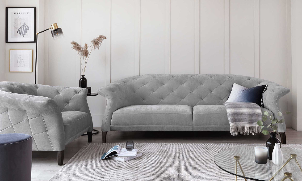 5 Things You Must Know About Fabric SofasAre you wondering what the benefits of a fabric sofa are? Our expert stylist, Katie, has shared her top styling tips and interior knowledge so that you’ve got all the info you need to pick the fabric sofa of your dreams.Read more
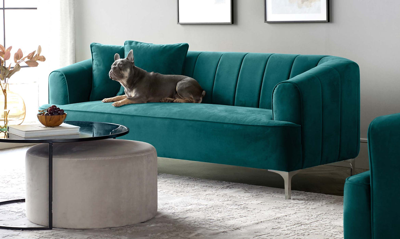 How To Clean A Velvet Sofa: Our Upholstery Care TipsA common misconception about velvet is that it’s a high-maintenance material. Well, let us bust that myth with this handy care and cleaning guide! When treated with the proper care and maintenance, you’ll find your velvet furniture is built to last.Read more


