

Choosing the Right Colour Schemes for Modern Homes
Colour stimulates the mind as well as our emotions. There is a wealth of information on the internet about the symbolism and history behind the use of certain colours. But we’re going to keep things simple and guide you in the direction of interior colour schemes. Take a look at our guide to help make that perfect colour choice!
The Colour Wheel – Your best friend when it comes to selecting interior paints.
Cool Colours
Cool colours are on the right-hand side of our colour wheel. They are hues ranging from Green to Blue, through Blue-Violet. These colours are best used when you want to create a calming and relaxing atmosphere. Cool colours are typically used in the living rooms and bedrooms, as they promote a sense of tranquillity and relaxation.
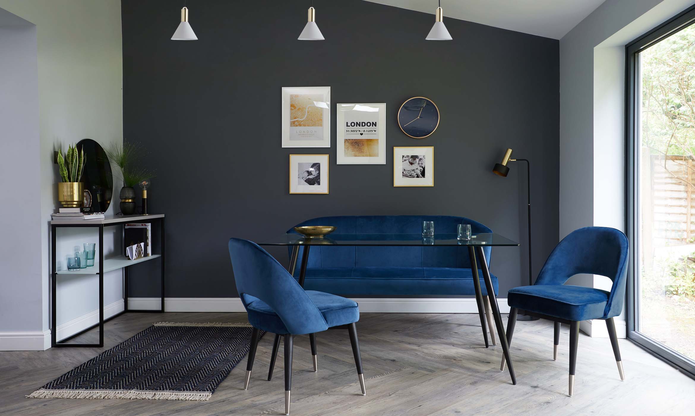
BLUES
Blue is a particular interior favourite for creating calmness, peace and tranquillity. It is a popular colour for many rooms due to the fact it can go with both traditional and modern styles.

Vintage styles can be created using blue with white and floral prints. Choose a chalky looking colour with a richness. Vintage homes need to feel authentic, so the deeper the colour, the better
Contemporary styles can be created using a cooler tone of blue with mismatched metallics and gloss finishes. Or try creating a more colourful interior by pairing shades of blue work well with pastel colours. Think soft apple greens or bright yellows for a great combination creating a sunny Mediterranean style.
GREENS
Green is the colour used to symbolize nature, balance, harmony and positivity. Pantone announced Greenery as its Colour of the Year 2017 due to its fresh, zesty feel. It creates a relaxing atmosphere when used in various tones.

Team with pastels and neutrals to create a contemporary look in a living room. Alternatively, for a country cottage look, work with shades of cream and neutrals for a look that’s very easy on the eyes.
Adding black and white to green can create an Art Deco look or why not be bold and try a retro theme with lime green for something a little different.
PURPLES
Purple can be a tricky colour to introduce into our homes. Pale Lilac can feel very young and sweet, but too dark can feel a bit seedy. The key to getting this trend right is using purple sparingly and combining with other colours.
When Pantone announced UltraViolet as 2018’s Colour of the Year, we were all a little unsure what to think. However, after reviewing the colour combinations suggested by Pantone, we came round to using purple in our homes. Keep your walls neutral and play with purple in your furniture and soft furnishings.
The Anzio Barstool is just the right amount of attitude and colour for modern kitchens. Keep accessories metallic for a cool vibe and for a lighter feeling home.
Warm Colours
Warm colours are on the left -hand side of our colour wheel. These are your reds, oranges, pinks and yellows. They are lively, stimulating and domineer over cool colours. Warm colours should not be used as a base colour and are best used when highlighting statement pieces in your room.
REDS
Just like warning signs, red is a colour which grabs your attention. Making it ideal when used on a feature wall or creating a statement piece in a room. As red is a very dominating, powerful colour, it’s best to use in the social rooms in your house, such as your kitchen or playroom.
Avoid using red in your bedroom or living room, as it is a very visually stimulating colour and will not help with the relaxation. That said, when used in small doses, red can often be more effective, so great for those decorative accessories.
For a more subtle red, take a look at Picture Callery Red, from Farrow and Ball for a more traditional and softer look. Pair with off-white and dark woods to create an antique vibe.
YELLOWS
Like the sunshine, yellow is bright and exudes excitement so ideal for a child’s room or in an entrance hallway. It is also effective when used to highlight elements of your space.

When choosing yellow furniture, be sure the rest of the decor is subtle, otherwise, you risk creating a very busy looking room. Navy and Yellow are a match made in heaven, so stick to dark blue walls and offset with a pop of mustard.
ORANGES
As a mixture of red and yellow, it shares both attributes of these colours. Although Orange is hot and fiery like Red, it is not as aggressive. Orange actually stimulates mental activity, so add a splash of orange in a study or children’s playroom. It also works well in a kitchen as is associated with appetite and health foods.
PINKS
Pink has been having a moment recently. Be in Millenial pink or Plaster pinks, we see different shades popping up all over the interior circuit. Blush pink has been a favourite in our homes for a while now, especially when paired with copper and white.
Create a real statement by painting a pink ombre wall. This is a great interior paint effect for a little girls room or a home office. tone down pink by mixing with Grey and White for a more grown-up look.

Neutrals
Neutrals are great for creating a light and soft environment and giving the illusion of space. This scheme looks stylish, sophisticated and is great used as a blank canvas. You can then injected with colour, print and pattern for interest.

This is ideal as a base colour as allows you to update the room by just using bright accents and accessories. These tones are great when used with warm tones such as rich red, mushroom, and terracotta.
BLACK
Black is formal, elegant and prestigious. It makes other colours stand out so ideal for teaming up with warm shades. Too much black in a space can make the room feel smaller so stick to limiting the quantities by adding accents of other colours. Black is perfect for that formal dining area to add a touch of class and style.

Perhaps try black Leather Dining Chairs as they are great at hiding marks and bring drama to your home. Our black chrome is a great alternative to a classic chrome finish, so go to the dark side and play with these inky tones.
Don't miss a thing
Simply enter your email address below and stay up to date with our latest news and products.
Explore Our Blogs
 A guide to styling your small gardenIn modern life, many of us now have smaller gardens, but that doesn't mean you can't style it how you would like without making it practical. If you have a small garden but are unsure on how to style it, see our tips and recommendations from our stylist Katie for an aesthetic, yet practical oasis.Read more
 Modern Coffee Tables: 4x Things You Need To Know When StylingOur expert stylist, Katie, has shared her top styling tips and interior knowledge so that you’ve got all the info you need to find the perfect coffee table for your space.Read more
 4 Things You Must Know About Leathers SofasOur expert stylist, Katie, has shared her top styling tips and interior knowledge so that you’ve got all the info you need to pick leather sofa of your dreams.Read more
 5 Things You Must Know About Fabric SofasAre you wondering what the benefits of a fabric sofa are? Our expert stylist, Katie, has shared her top styling tips and interior knowledge so that you’ve got all the info you need to pick the fabric sofa of your dreams.Read more
 How To Clean A Velvet Sofa: Our Upholstery Care TipsA common misconception about velvet is that it’s a high-maintenance material. Well, let us bust that myth with this handy care and cleaning guide! When treated with the proper care and maintenance, you’ll find your velvet furniture is built to last.Read more


